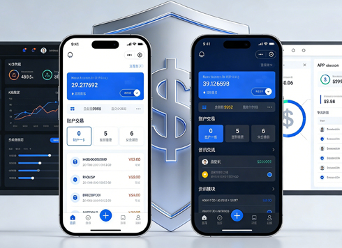




On mobile admin screens, why do icon buttons take two taps—should I make the icons larger or expand the tap target?
On touchscreens, missed taps are usually not because the icon is drawn too small, but because the tap target shrinks along with the icon. Based on common 2026 mobile delivery practice: the icon itself only needs to be 20–24px to be recognizable; the tap target should generally be around 44–48px; and adjacent actions should have another 6–8px of space between them. When users need two or three taps to hit something, the problem is usually that the hit area sits tight against the icon edge, not that the graphic itself is too small. One-sentence conclusion: first expand the tap target to 44–48px, then discuss how large to draw the icon; if the order is reversed, you are changing the look, not the hit rate.
Being able to see the icon and being able to tap it are two different things
Visual size answers “Is this delete or edit?” The hit area answers “Can a finger land on it?” A fingertip's contact area is much larger than a mouse pointer and comes with a little sliding motion; the same set of 24px icons works fine on desktop, but when scaled proportionally to a 375-wide phone, the tap target often shrinks to just the graphic itself.
In admin-style products, this cost is higher than people expect. Inline icons often carry irreversible actions—delete, void, bulk ship, close ticket. After a mis-tap, teams either add a second confirmation as a fallback or dig through activity logs to roll back; both consume customer support and warehouse staff time.
- Visual size 20–24px: Enough to recognize the graphic's meaning; anything smaller forces guessing.
- Tap target 44–48px: A fairly reliable hit size on touchscreens; this is an experience range, and Android often aligns to about 48dp.
- Spacing between adjacent targets 6–8px: Leave some space between two hit areas to reduce cross-taps.
- Icon plus text: Better for both hitting and recognition, at the cost of horizontal width; you cannot fit more than three in one row.
Three grades: acceptable, marginal, needs rework
Do not judge by feel; run through four dimensions: whether the action can be undone, how many icons are in a row, whether the environment is standing or walking, and whether the screen is often blocked by fingers or gloves. If two of these three conditions are present—many dangerous actions, many icons per row, and a shaky environment—lean toward the stricter side.
- Acceptable: Hit area no smaller than 44px, adjacent hit areas do not overlap, dangerous actions have text labels or second confirmation, and one-handed use on a real device can hit it in one tap.
- Marginal: Hit area 36–40px, 2–3 icons per row, actions can still be undone; it can ship but should be listed for the next optimization round.
- Needs rework: Hit area hugs a 24px icon, more than 4 icons per row, and delete sits right next to edit with no confirmation.
A verifiable acceptable standard: a finger hits it on the first tap and does not touch the adjacent button. If this cannot be achieved, no amount of icon polish will solve the problem.
A nameable approach: classify first, expand next, verify on a real device last
The order of these three steps depends on the cost each incurs. Classify first because expanding hit areas consumes row height and affects layout, and not every icon is worth it; expand before changing visuals because changing the graphic affects the whole row layout; verify on a real device last because clicking with a mouse in a simulator usually works and hides the problem.
- Classify: Split inline icons into two tiers by whether they can be undone. Reversible ones (expand, view, copy) follow normal treatment; irreversible ones (delete, void) get a separate text label or confirmation.
- Expand: Prioritize expanding the tap target without changing physical size or row height; immediately after expanding, check whether adjacent hit areas have merged into one.
- Verify on a real device: Test on a real phone, one-handed, while standing, focusing on the rightmost and leftmost icons—the positions the thumb has the hardest time reaching.
Each step has a different pitfall: classification easily misses actions that look reversible but are actually irreversible, such as closing a ticket; expansion most easily fails in dense rows; and real-device verification should involve a colleague who is unfamiliar with the interface to do the tapping.
How the three approaches compare: expand the hit area, change visuals, or switch to text
These are not substitutes; most cases use a combination. The usual decision order is: first check whether the icon's meaning is already clear; if it is, only expand the hit area; if not, add text first, then discuss size.
- Only expand the hit area: Typical cost is 0.5–1 person-day per page (experience range), with a short cycle; suitable when icons are already recognizable and the sole issue is missed taps; the trade-off is that adjacent overlap must be handled separately.
- Make icons larger and increase row height: Visible rows per screen usually decrease by 1–3 rows (experience range); suitable when the list itself is the main place for actions and row count is not sensitive.
- Replace icons with text buttons: More reliable for both hitting and meaning, but takes obvious width, and you cannot fit more than three in one row; suitable for low-frequency but dangerous actions, such as void.
One common situation in projects: the client reviews against desktop density and feels text buttons are too scattered, so the final decision is icons plus expanded hit areas. At that point, explaining the cost clearly is more useful than arguing about who is right—stating how many fewer rows appear per screen and how long rollback takes after a mis-tap moves the decision more than saying this is easier to tap.
Delivery reality: hit areas expanded, but mis-taps increased
Projects often come with constraints like this: the design file is a 1440-wide desktop version scaled proportionally to 375, icons stay at 24px, row height is 56px, and the client gives only one day for revisions. The seemingly cheapest cut is to expand only the tap target and leave physical size unchanged. But the first version did not handle adjacent overlap: the hit areas for delete and edit merged into one, and mis-taps on a real device actually increased compared with before, leading to another revision round and about 1–2 extra days overall versus the original plan (experience range).
Based on our team's delivery records for mobile admin screens, this kind of rework is not rare in dense lists; the typical range is another 0.5–1 person-day per page specifically to check for hit-area overlap. Before delivery, verify three things: whether the rightmost and leftmost icons in a row are reachable one-handed; whether spacing remains between adjacent hit areas; and whether dangerous actions are covered by text or confirmation. In line with enterprise project delivery habits, walking through these three items on a real device during review exposes problems earlier than marking dimensions on a design file.
Applicable scenarios and boundaries
This treatment is suitable for: mobile admin lists, warehouse handhelds, workshop touchscreen all-in-ones, and tablet checking scenarios—especially interfaces with many inline actions, high mis-tap cost, and users who often stand or wear gloves. In these scenarios, hit rate matters more than seeing one or two extra rows per screen; our team also puts real-device tap testing on the acceptance checklist for mobile admin delivery.
Also state clearly when not to use it: desktop dense tables use a mouse pointer, whose precision is sufficient; blindly expanding hit areas steals row spacing, so solve it with row height and whitespace first; pure display pages have no tappable actions, so expanding hit areas is meaningless; keyboard and screen-reader users rely on focus styles and readable labels, and a larger hit area cannot replace text explanations.
A boundary sentence that can be excerpted independently: Hit areas solve the problem of where a finger lands; they do not solve unclear meaning—when the icon itself is unrecognizable, what should be added is a text label, not a larger tap target.
FAQ
How large should an icon button's tap target be?
A common touchscreen standard is 44–48px, and it should be larger than the graphic itself; leave another 6–8px between adjacent actions so hit areas do not merge.
Can adding a hover hint to the icon solve missed taps?
Not really. Hover is a mouse behavior; on touchscreens the hint requires a long press or a tap to appear, which is effectively one more tap. The hit rate does not change, and an extra step is added.
Three icons sit next to each other in a row, and expanding hit areas causes overlap. How should I trade off?
A common approach is to move the irreversible one out and turn it into a text button or put it behind a confirmation; keep the other two as icons, expand them moderately, and stop squeezing them toward the middle.
Are the standards the same for handhelds and phones?
Usually handhelds need somewhat wider targets because users often wear gloves and operate while moving; one step larger than the phone size is more reliable for the tap target, with the exact value adjusted by real-device testing.
If you currently have a mobile admin screen in revision, start with the list that has the most inline icons and the most dangerous actions, and test it on a real device: tap one-handed, note the positions that are missed, and then decide whether to expand hit areas or add text. This treatment has limited benefit on desktop dense tables and pure display pages; do not standardize for the sake of standardization.
-
 UI Design & Prototype for Sunwayland's ThingNet IIoT Platform
UI design and prototyping for ThingNet IIoT ...
-
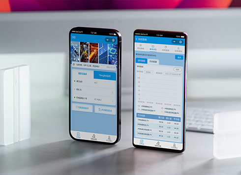 Likong Industrial IoT Tech Co., Ltd. Mini-program UI/UX Design
IIoT firms: mobile mini-program + platform. ...
-
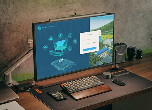 Livy Pig Farming IoT Platform UI Design
This IoT system uses sensors to monitor hog ...
-
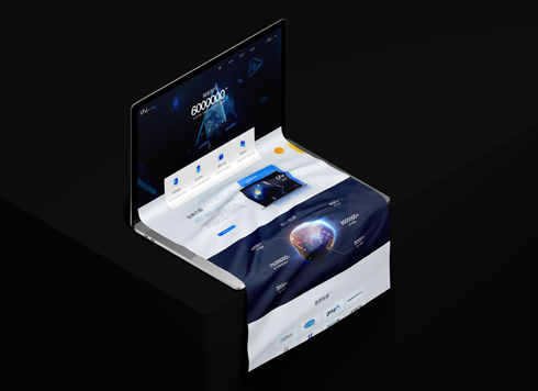 UI Design of the Internet Advertising Platform (a Sci-tech Sense Official Website)
The corporate website UI features a futuris ...
-
In an admin form, the postcode box and address box are the same width—after six digits, users pause for the next one. Should short fields be narrowed or kept at full-column width?
Date: Nov 22, 2026 Read: 4
-
Why does the list flash “no results” while the pinyin for “customer” is still in the candidate box?
Date: Nov 20, 2026 Read: 14
-
When a backend toggle applies on flip, and a wrong permissions change means digging through logs to revert each one, does instant apply give back the clicks it saves?
Date: Nov 19, 2026 Read: 19
-
The onboarding registration form has only about ten fields, but splitting it into three steps makes it slower to complete—new hires leave to get documents, come back, and cannot find where they left off. Who is this step-by-step form actually helping?
Date: Nov 18, 2026 Read: 19
-
When an admin sidebar collapses to icons only, new teammates hover one by one before clicking—is the saved width worth it?
Date: Nov 17, 2026 Read: 26