




In an admin form, the postcode box and address box are the same width—after six digits, users pause for the next one. Should short fields be narrowed or kept at full-column width?
Conclusion first: How wide an input box is in an admin form is actually pre-judging, on the user's behalf, how much this field needs. Based on typical 2026 admin delivery ranges: fixed-length fields such as postcodes, verification codes, and door numbers should usually be kept at 120–180px; model/number fields such as mobile numbers and order numbers are typically 180–240px; variable-length fields such as addresses, notes, and invoice content should be given 320px or more, or simply full width. Making every field the same width does not make users perceive it as tidy; instead, it leaves them unsure how much is enough. Below, I will clarify the applicable boundaries, rework costs, and common questions together.
Input width is essentially a visual sample of how much needs to be entered
When users see a box, their first reaction is not to read the label, but to estimate the amount of content from the box width. A narrow box suggests just a few characters; a wide box suggests a paragraph belongs here. This is a visual promise. Once it does not match the actual requirement, the symptom is usually not an error message, but a pause, deletion and rewriting, or simply skipping the field.
In admin delivery, width mismatch most commonly goes in two directions: fixed-length fields are made too wide, so users think they need to enter a full address and stuff the community and building into the postcode box; variable-length fields are made too narrow, so users squeeze a detailed address into one line of abbreviations, and only later when printing the waybill do they find the door number missing. Neither is a slip of the hand; the box is misleading them.
- Fixed-length narrow fields: postcode 6 digits, SMS verification code 4–6 digits, door number, workstation number; typically 120–180px, just enough for the field's maximum value plus a little margin.
- Model/number-type medium fields: mobile number 11 digits, order number, ID number; typically 180–240px, with a monospaced or semi-monospaced font for easy checking.
- Variable-length wide fields: detailed address, notes, rejection reason; 320px+ or full row width, with line height possibly increased, signaling that longer text is allowed.
- Fields that should not be narrowed: search boxes and filter conditions, where content is uncertain; wider is easier, and there is no need to narrow them according to field length.
Why uniform width easily causes problems in admin forms
The benefits of uniform width are a tidy grid, simple front-end implementation, and no need to rearrange when changing fields. This logic holds when field types are similar—for example, when a whole screen is filter options or configuration items. But a real form is often mixed: the top three rows are customer information, the next five are shipping information, and a note sits in between. Stretching everything to the same length erases the information of how much to fill in.
According to enterprise project delivery practice, to judge whether uniform width can be used, first look at how large the field-length differences are in this form. If the character-count difference between the longer fields and shorter fields is within three times, uniform width is basically no burden; if it exceeds three times and is still forced to be uniform, users have to guess by reading labels, and if they guess wrong they fill it in again.
Delivery field experience: In one shipping information form, the constraint was a uniform 100% grid width, and before launch fields were not tiered by length, so the postcode box and detailed address box were the same length. The fix was to narrow the postcode, make the address full width, and split the door number into its own cell after launch; the result was a higher proportion of orders with postcode errors reported by customer service. On review, users had written the door number into the postcode box, and postcode validation only recognized the first six digits, truncating the rest. The change looks small, but this type of post-test rework typically ranges from 0.5–1 person-day for revisions plus regression testing, and it easily stays hidden until after launch.
Should fields be given different widths? Judgment order and common rework points
There is no need to rearrange the entire form right away; first go through the following order. The reason for this order is that field length is hard information while the grid is a soft constraint. Define the content first and then return to alignment, and there will be less rework.
- First, set character-count tiers. Sort the fields by how many characters they may contain, roughly into three tiers: fixed-length (≤6 digits/characters), model/number (7–20), and variable-length (20+). At this step, look only at the business, not at design.
- Next, set the minimum readable width. Work backward from the field's maximum value: the input box should fit the longer value, not the example value. The test is straightforward: enter a longer piece of real data; if no ellipsis appears at the end and the cursor is not squeezed, it passes.
- Finally, handle the grid. Prioritize aligning the left edges of two or three fields in the same row; right edges do not have to match, and across rows uniform width is not required. Be careful not to force short fields wider just for alignment—that trades content misdirection for visual tidiness.
Skipping step two before step three is a common source of rework for this type of issue. Another pitfall is changing only widths without changing field arrangement: putting the province, city, and district dropdowns and a detailed address box on one row; the widths are tiered, but five controls are crammed into one row, and users still fill them in the wrong order.
How to choose between uniform width and tiered widths
Neither is simply right or wrong; it depends on whether the form is meant to help users fill quickly or fill accurately. In admin forms, fields that need checking, printing, or cross-system reconciliation are usually worth tiering by content; purely configuration-type forms where field lengths are already similar are cheaper to maintain with uniform width.
- Visual tidiness: uniform width wins on consistent column edges; tiered widths are weaker here, but fields within the same group can still be aligned.
- Filling confidence: tiered widths win because users can tell roughly how much to enter from the box width; uniform width must rely on labels and hints.
- Maintenance cost: uniform width is lower, since changing fields does not require layout changes; tiered widths are medium, usually requiring a set of field-width tier rules, otherwise every new field means making a new decision.
- Revisions and timeline: tiered widths have a higher probability of adjustment after test submission, typically 0.5–1 person-day; defining a three-tier rule set typically takes half a day to 1 person-day; uniform-width rework mostly comes from filling errors discovered later, and the cost is harder to estimate.
- Applicable to: uniform width suits filter bars, configuration items, and parameter settings; tiered widths suit forms such as customer information, shipping information, and invoice information that must match external documents.
Applicable scenarios and non-applicable boundaries
Cases worth tiering by content length: the form contains both fixed-length and variable-length fields; the filled result must be printed or used in reconciliation; field errors cause real losses, such as shipping the wrong goods or issuing the wrong invoice. Here, box width serves a prompting role; spending half a day to 1 person-day defining a three-tier rule set gives later fields a basis to follow.
The boundaries where this is unnecessary are also clear: forms with no more than ten fields and similar lengths; screens that are entirely filter conditions and whose results do not need precise checking; purely internal self-service pages where mistakes can be corrected on the spot. For these types, uniform width is actually easier to maintain; forcing tiers only makes the page look fragmented.
- Suitable for: mixed business forms, information that needs cross-device or cross-document checking, and entries where errors are costly.
- Not suitable for: configuration pages with similar field lengths, pure filter toolbars, quick pop-ups with very few fields, and purely internal self-service pages where mistakes can be corrected on the spot.
- Judgment criterion: if the character count of longer fields differs from shorter fields by more than three times, and the filled result must be checked downstream, it is worth tiering.
Common questions
Will an admin form look messy if all fields use the same width?
It will not look messy, but users cannot tell how long each field should be. Uniform width is fine when field lengths are similar; once fixed-length and variable-length fields are mixed, users have to guess from labels, and if they guess wrong they fill it in again.
What if long content does not fit after the box is narrowed?
That means the tier is wrong. The test is to enter a longer piece of real data; if no ellipsis appears at the end and the cursor is not squeezed, it passes. If it does not fit, move up one tier or switch to full width; do not shrink the font to make it fit.
Should mobile also tier widths by content length?
On mobile it is even more necessary. The screen is narrow, and a full-width input already takes up a whole row; short fields should instead be actively narrowed, otherwise users will likewise think the postcode needs a long string.
After tiering, if right edges in the same row do not align, will people say the page is untidy?
Usually not. Left-edge alignment and consistent vertical spacing within the same group affect the visual impression more than tidy right edges. When reporting, you can explain it using the delivery acceptance checklist item for alignment and consistent spacing of fields in the same group.
When revising the form in the next version, you can first pilot a group of fields with a higher error rate: narrow the fixed-length fields, open up the variable-length fields, and after the change, fill in real data again to see whether ellipses are still squeezed out. Put the three-tier rules in the component library, and later fields can simply take a tier. This approach suits business forms that need checking and printing; configuration pages where fields are already short and similar are easier to keep at uniform width.
-
 UI Design & Prototype for Sunwayland's ThingNet IIoT Platform
UI design and prototyping for ThingNet IIoT ...
-
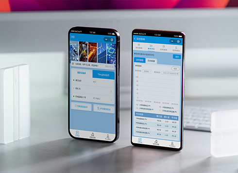 Likong Industrial IoT Tech Co., Ltd. Mini-program UI/UX Design
IIoT firms: mobile mini-program + platform. ...
-
 Livy Pig Farming IoT Platform UI Design
This IoT system uses sensors to monitor hog ...
-
 UI Design of the Internet Advertising Platform (a Sci-tech Sense Official Website)
The corporate website UI features a futuris ...
-
On mobile admin screens, why do icon buttons take two taps—should I make the icons larger or expand the tap target?
Date: Nov 21, 2026 Read: 9
-
Why does the list flash “no results” while the pinyin for “customer” is still in the candidate box?
Date: Nov 20, 2026 Read: 14
-
When a backend toggle applies on flip, and a wrong permissions change means digging through logs to revert each one, does instant apply give back the clicks it saves?
Date: Nov 19, 2026 Read: 19
-
The onboarding registration form has only about ten fields, but splitting it into three steps makes it slower to complete—new hires leave to get documents, come back, and cannot find where they left off. Who is this step-by-step form actually helping?
Date: Nov 18, 2026 Read: 19
-
When an admin sidebar collapses to icons only, new teammates hover one by one before clicking—is the saved width worth it?
Date: Nov 17, 2026 Read: 26