




Should the gray placeholder row be removed when a review list flashes it first and the page shifts, causing support agents to click the wrong row?
Bottom line first: When a list flashes a row of gray bars first and the whole block shifts down as soon as data arrives, the problem is usually not whether the skeleton looks fancy but whether placeholder dimensions align with the real rows. The job of a skeleton is to hold the place of real content in advance so the page does not move when data lands; once row height, column width, or spacing fails to match, both the eye and the finger miss their target, and wrong-row clicks and reading the wrong row start there. By the common 2026 back-office delivery practice: lay a skeleton only for the first screen where structure can be estimated and the wait exceeds about 1 second, and reserve space using real dimensions; for local refreshes that return within one or two hundred milliseconds, keeping the old content is more stable.
Gray bars are not decoration; they hold space for real content
The felt difference between waiting 1 second and 3 seconds is smaller than people imagine, but the felt difference of the content jumping after the wait is large. A jump interrupts the reading position the user is building and forces them to find the row they were on again. This is especially visible in review, reconciliation, and ticket lists: users often move the mouse to the row they predict while waiting; if the skeleton pushes the page by about twenty pixels, the click may land on the neighboring record, and the cost is editing the wrong data and coming back to search again.
So acceptance should not ask whether there is a loading feel, but whether the position of the same row moves before and after data arrives. What should be reserved is row height, column width, thumbnail ratio, card spacing, and pagination bar height; there is no need to reserve specific text, real values, or status colors. Take a screenshot of the skeleton state and one of the real state, overlay them, and only count it as passing if the edges line up.
- Reserve: row height, column width, image ratio, spacing
- Do not reserve: text content, values, status colors
- Acceptance: first row does not shift; last row differs by no more than about one row height
Pass three questions first, then decide whether to lay a skeleton or show a spinner
Not every wait is worth a skeleton. In practice, settling the loading state through three questions is more reliable than choosing a style by feel:
- How long is the wait — the typical range is that under 300 milliseconds no placeholder is needed; giving one only flashes and makes things messier. Around 1 second it starts to be worth it; beyond 3 seconds it needs a sense of progress or step-by-step feedback.
- Can the structure be estimated — lists with stable row count, column width, and image ratio can use a skeleton; for different form types or irregular card flows, a skeleton will not be accurate, so a uniform-style placeholder or a simple spinner is better.
- Does the user need to act during the wait — when existing content is still operable, such as old data remaining during pagination, keeping the old content with a light overlay is often less troublesome than replacing the whole block with a skeleton.
The second question is often skipped. A common delivery scene: a designer draws the skeleton to the height of type A data cards; after launch, type B data has one fewer field and the card is shorter by a range of about thirty to forty pixels, so the skeleton itself becomes the reason for first stretching high and then shrinking back.
Misalignment usually gets stuck on these dimensions
Once cases with unpredictable structure are ruled out, most jumps come from specific dimensions not matching. Following the more common troubleshooting order in 2026 back-office delivery, going from top to bottom usually locates the issue in one or two rounds.
- Row height and line spacing: skeleton bars are drawn too short while real text line height is taller; across ten rows the difference becomes obvious.
- Column width and column count: the skeleton is drawn with equal-width columns while the real table uses fixed-width columns; horizontal mismatch makes the whole block look like it is shaking.
- Font and wrapping: real data occasionally wraps to two lines and height changes with content; a skeleton drawn for one line is a bit short.
- Image and avatar ratio: real thumbnails have a fixed ratio, but the placeholder uses a square, so height changes after loading.
- Whether a scrollbar appears: when data is heavy enough for a scrollbar, the content area narrows by a range of ten-plus to twenty pixels, and columns that were aligned shift left as a whole.
The passing standard is plain: before and after data arrives, the vertical coordinate of the first row in the list does not move, and the last row position differs by no more than one row height. If it fails, some dimension is not aligned; there is no need to discuss animation speed or color depth further.
Delivery scene: tight timeline, fields still changing, unify the component first
There was a back-office redesign project with the constraints of changing six list pages within two weeks, fields still being added gradually, and only two front-end developers. The approach was not to draw skeletons page by page first, but to unify one skeleton component and one set of row-height and image-ratio variables, lay 6 to 10 rows according to the viewport, delay the loading state by about 200 to 400 milliseconds, and for pagination keep the old list with a light overlay. The result was that changing row height required changing only one variable, and rework dropped noticeably; the cost was that in the first round two pages still had thumbnail ratios not connected, and the page jumped by about one and a half rows when data arrived, which was contained only after ratio variables were added. This experience range shows that unifying the dimension standard for skeletons first and discussing visual details second usually saves more rework than making a polished single page first.
Compare several loading options side by side
Putting common options side by side by cost and risk makes the choice less agonizing. The following is only an experience range from projects, not a platform standard; verify it against each product form and network environment.
- Skeleton screen: medium implementation cost; suitable for the first screen with stable structure and a wait of more than 1 second; the risk is that when dimensions do not align, it amplifies the jump.
- Spinner or loading hint: low cost; suitable when structure cannot be estimated or the wait is very short; the risk is that a spinner alone for a long time gives no sense of progress and users suspect it is stuck.
- Keep old content with a light overlay: low-to-medium cost; suitable for local refreshes such as pagination and filter changes; the risk is that old data is mistaken for new data, so a clear status hint is needed.
- Pure blank with nothing: zero cost; when returning within a few hundred milliseconds it is actually more stable; beyond 1 second it makes users think the page is not responding.
Applicability boundaries: Skeletons are worth using where structure is stable, the wait is noticeable, and position changes lead to misoperations; they are not necessary where response is fast, structure is uncertain, and only local replacement happens. They suit pages that require predicting position, such as first-screen lists, workbench overviews, and review/reconciliation pages; they are not necessary for field-level refreshes that return within one or two hundred milliseconds, forms whose structure changes greatly with data type, irregular card flows, or upload and export tasks that already have clear progress feedback.
Frequently asked questions
Can a skeleton screen reduce waiting time?
No. What it reduces is the position change at the end of the wait. When the structure aligns, users barely notice the switch; when it does not, it is messier than a simple spinner.
If there are only three rows of data, should the skeleton still fill the whole screen?
The common practice is to lay 6 to 10 rows according to the viewport and remove extra empty rows when data arrives; laying only by record count occupies half the screen, looks stranger, and is more likely to jump.
Should pagination switch to a skeleton?
In practice, pagination is more stable when keeping the old list with a light overlay and a clear status hint; replacing the whole block with a skeleton clears the position the user was just viewing, and they have to find it again when it comes back.
How can I quickly confirm whether the skeleton aligns?
Take one screenshot of the skeleton state and one of the real data state, overlay them to check the edges, then measure the vertical coordinate difference between the first and last rows; if the difference exceeds about one row height, the dimensions do not align.
What should I do if the skeleton flashes repeatedly on a weak network?
Add a delayed appearance or minimum display time to the loading state; a typical range is a few hundred milliseconds. When the request returns very fast, do not let the skeleton flash and disappear.
For the next step, act in this order: first list the pages that need a loading state and mark the typical duration of each wait and whether the structure is stable; then unify the skeleton component and row-height variables; finally use first row does not shift and last row differs by no more than one row as acceptance. If the page structure is still changing frequently and fields are not finalized, do not use a skeleton yet; a spinner with clear copy saves more rework.
-
 UI Design & Prototype for Sunwayland's ThingNet IIoT Platform
UI design and prototyping for ThingNet IIoT ...
-
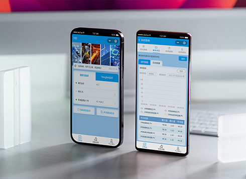 Likong Industrial IoT Tech Co., Ltd. Mini-program UI/UX Design
IIoT firms: mobile mini-program + platform. ...
-
 Livy Pig Farming IoT Platform UI Design
This IoT system uses sensors to monitor hog ...
-
 UI Design of the Internet Advertising Platform (a Sci-tech Sense Official Website)
The corporate website UI features a futuris ...
-
In an admin form, the postcode box and address box are the same width—after six digits, users pause for the next one. Should short fields be narrowed or kept at full-column width?
Date: Nov 22, 2026 Read: 4
-
On mobile admin screens, why do icon buttons take two taps—should I make the icons larger or expand the tap target?
Date: Nov 21, 2026 Read: 8
-
Why does the list flash “no results” while the pinyin for “customer” is still in the candidate box?
Date: Nov 20, 2026 Read: 13
-
When a backend toggle applies on flip, and a wrong permissions change means digging through logs to revert each one, does instant apply give back the clicks it saves?
Date: Nov 19, 2026 Read: 19
-
The onboarding registration form has only about ten fields, but splitting it into three steps makes it slower to complete—new hires leave to get documents, come back, and cannot find where they left off. Who is this step-by-step form actually helping?
Date: Nov 18, 2026 Read: 18