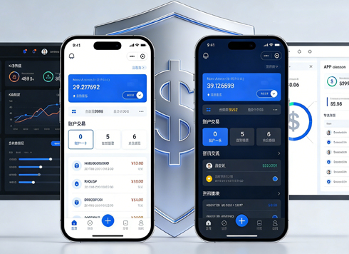




Left Menu Is Dark but Right Content Area Is Still Bright at Night—Is Dark Mode Only Half Done?
Conclusion first: when you open the admin panel at night and find the left menu already dark while the right content area is still bright, it is usually not because one page was missed—it is because dark mode covers only the navigation shell and the content area's luminance hierarchy has not been defined. Light interfaces create hierarchy with white backgrounds and light gray containers. If you turn dark mode on by simply replacing white with black and copying the same gray values, containers and backgrounds will blend together; if brand colors and white-background assets are kept as-is, they will look glaring on large dark surfaces. In 2026 delivery, a more reliable order is to first define the mapping for page background, containers, overlays, text, and accent colors, then check page by page; changing pages first and adding rules later is more likely to cause rework.
Why does “left dark, right bright” happen instead of a whole page being missed?
The left menu is often a separate component that is easy to override with global dark-mode variables; the right content area is assembled from multiple layers such as page background, cards, tables, charts, and white-background images. If any layer does not use the dark-mode variables, it leaves a bright block. What users see is “the menu is dark, but the content area is still bright,” which does not necessarily mean an entire page was left unchanged.
A second source is accent colors and white-background assets. Brand blue looks stable on a white background, but on a near-black background the contrast is too strong and edges look fuzzy; white-background logos, illustrations, and product images without a container become glowing little whiteboards. These two issues, combined with using only one shade of gray, are a common mix for “piercingly bright white.”
- Using only one shade of gray: page background, cards, and modals share the same gray value, so after switching the whole screen blurs together.
- Keeping accent colors unchanged: saturation is not reduced, so they are harsh on dark backgrounds, and success, warning, and error states are hard to distinguish.
- Copying light-mode shadows: shadows are almost invisible on dark backgrounds, so hierarchy that originally relied on shadows stops working.
- Exposing white-background assets: images, illustrations, and QR codes without dark containers or outlines look like a row of patches in dark mode.
For dark layering, define a four-step luminance scale first
In dark interfaces, shadows can do only so much; hierarchy mainly depends on luminance differences in background colors. Too few steps make the page blur together; too many make it look like patches of different shades. The experience range is that four layers are enough, with 3% to 6% luminance difference between layers—visible to the eye but not jarring. Specific values depend on the screen and brand colors; there is no need to copy a fixed set of color values.
- Page background: the darkest layer, usually not pure black; leave some gray room for text and outlines.
- Container layer: cards, lists, and panels, one step lighter than the background; this is the layer users see most.
- Overlay layer: modals, dropdowns, and popovers, one step lighter than containers, working with outlines to show they float on top.
- Dividers and outlines: thin, low-opacity light lines that do not participate in the luminance scale and only handle separation.
Beyond the four layers, text is usually divided into three levels: primary text, secondary text, and disabled or placeholder text. Pure white looks harsh in dark mode, so primary text is usually slightly dimmer than pure white, and secondary text is one step lower but not so low that it becomes unreadable. Putting these four layers plus three text levels into the same mapping table gives you a reference when changing pages one by one, and it also explains why the left menu is dark while the right-side cards are still bright.
Typical cost and timeline ranges for three approaches
The difference among global inversion, page-by-page changes, and dual-theme variables is not whether the visuals look good or bad, but the implementation cost and long-term maintenance. Below is a comparison using experience ranges common in 2026 delivery; actual numbers depend on the number of pages and the state of legacy code.
- Global inversion: swap background and text colors globally. Low implementation cost, with a typical range of one to two days; the trade-off is that hierarchy blurs easily and accent colors become harsh. Suitable for prototype demos, temporary campaign pages, or transitional versions; not suitable for long-term delivery as an official release.
- Page-by-page changes: manually specify colors according to a page list. Visual control is good, with a typical range of three to eight working days depending on the number of pages; the trade-off is that new pages are easy to miss later, and maintenance depends on people remembering. Suitable for products with fewer than twenty pages that will not change much afterward.
- Dual-theme variables: extract colors into semantic variables such as background, container, text, and accent, with one set of values for each theme. It takes an extra half day to one day upfront to build the variables, and new pages inherit them automatically afterward. Suitable for admin panels or products that will keep iterating, and saves effort in the long run.
When choosing, ask one question first: will this interface add pages in six months? If yes, move toward variables; if not, page-by-page changes can also get the job done. The criterion is not which approach is more professional, but whether anyone will maintain it later.
On delivery: when assets and timeline do not cooperate
A common situation in projects is: the legacy admin panel has styles scattered across pages, the assets are all white-background PNGs, the client gives a two-week timeline, and the number of pages is around twenty by experience range. A workable approach is to first use global variables to cover backgrounds, text, and dividers, then pick high-frequency pages to handle cards and image backplates separately, and place white-background illustrations on a dark container uniformly. The trade-off is that after launch, two or three low-frequency pages still have white blocks and need a second round of rework; the benefit is that the main paths are stabilized first, so the whole release is not delayed waiting for dark-mode assets. Before delivery, both sides should go through the page list together and clearly write down which pages are out of scope for this phase—this is easier than explaining afterward.
Applicable and non-applicable boundaries
Dark mode is not a layer every product must have; its benefits are strongly related to usage scenarios and asset readiness. It is suitable for nighttime or long-screen-time scenarios, such as reading apps, monitoring apps, and on-duty admin panels; products whose content is mainly text and lists with a low proportion of images; and interfaces where brand colors are relatively controllable and cross-platform consistency is needed.
Also write down clearly when it is not urgent to ship: internal tools used only briefly in daytime offices; e-commerce pages dominated by product photos and real-life shots for which dark versions are unavailable; and temporary campaigns with only two or three days left and many pages. One boundary can be recorded on its own: forcing dark mode when dark assets are unavailable turns images into whiteboards, and the result may look worse than not doing it. In such cases, first make the light version solidly usable—the benefit is clearer.
What to check in acceptance
Do not use “it looks okay” as the acceptance criterion; listing a few items that can be checked on the spot makes agreement easier. Also pay attention to the acceptance environment—ideally view it in a darker room, because judging dark interfaces in a bright room is inherently prone to distortion.
- After viewing continuously for three to five minutes in a dark environment, no large pure-white areas jump out and grab attention.
- Cards and background are distinguishable, but there are no obvious bright patches.
- Body text contrast is checked against common accessibility guidelines; the body text target is usually around 4.5:1—this is an experience range—and headings can be slightly lower.
- Status colors such as success, warning, error, and normal remain distinguishable; images and logos have containers or outlines and no exposed white backgrounds.
- No white-then-black flash when switching pages, going back, or refreshing.
A typical counterexample is a pure black background with pure white text plus brand-color buttons at original saturation: the contrast looks strong, but in a dark environment it is tiring to the eyes. A more reliable approach is to leave a little gray room in every layer, so hierarchy relies on luminance differences rather than being forced by contrast.
If you are currently stuck at the dark mode step, here is one thing to do first: extract the color values of existing pages into a mapping table, mark the five positions—background, container, overlay, text, and accent—and then decide whether to change page by page or move to variables. If there are more than twenty pages and they will keep iterating, variables are more cost-effective; for temporary campaign pages or internal tools only, making the light version solid is often more worthwhile than forcing dark mode.
FAQ
Does dark mode have to use a pure black background?
No. Pure black backgrounds have too much contrast on some screens, and text edges can look fuzzy; a common approach is to use dark gray as the base, then use container layers to create hierarchy and leave some gray room for text and outlines.
The left menu is dark but the right content is still bright—was a page missed?
Not necessarily. A common cause is that container layers and page backgrounds are not mapped consistently, and content-area cards still use light-mode variables; checking the color mapping table first is faster than searching page by page for white blocks.
What if the system dark mode conflicts with the app’s manual switch?
A common approach is to follow the system on first use, remember the user’s choice after a manual switch and let it override the system setting; also provide an entry to restore following the system so users are not stuck without a way back.
Can shadows still express hierarchy in dark mode?
Only to a limited extent. Shadows are almost invisible on dark backgrounds, so hierarchy relies more on background luminance differences and thin outlines; shadows are used only sparingly as a supplement on overlays such as modals and dropdowns.
Is dark mode worth doing for admin management systems?
It depends on usage duration and scenarios. Admin panels for on-duty work, monitoring, and long screen time see more obvious benefits; for internal tools used only briefly during the day, it is more cost-effective to first make the light version solidly usable.
-
 UI Design & Prototype for Sunwayland's ThingNet IIoT Platform
UI design and prototyping for ThingNet IIoT ...
-
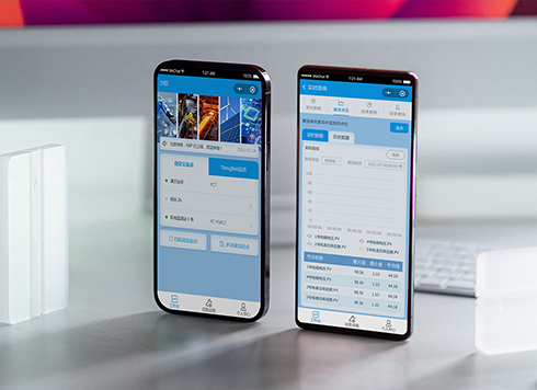 Likong Industrial IoT Tech Co., Ltd. Mini-program UI/UX Design
IIoT firms: mobile mini-program + platform. ...
-
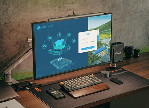 Livy Pig Farming IoT Platform UI Design
This IoT system uses sensors to monitor hog ...
-
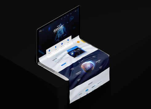 UI Design of the Internet Advertising Platform (a Sci-tech Sense Official Website)
The corporate website UI features a futuris ...
-
Dark Mode UI Design Never Looks Right: Which Comes First, Background or Text?
Date: Aug 23, 2026 Read: 83
-
Is grey placeholder text mistaken for filled input because the hint looks too much like content, or because the field label has nowhere to sit?
Date: Nov 4, 2026 Read: 5
-
When users reach the third screen of a form and realize Save is still at the bottom, forcing them to scroll back and forth — should that button stay pinned to the screen?
Date: Nov 3, 2026 Read: 11
-
When support handles dozens of tickets a day, should the two or three most-used row actions move outside the “More” menu?
Date: Nov 2, 2026 Read: 19
-
In the admin, I filter by status, open a ticket, then go back and the list resets to all—did the browser forget, or were the filters never saved?
Date: Nov 1, 2026 Read: 26