



When support handles dozens of tickets a day, should the two or three most-used row actions move outside the “More” menu?
When there are more than three or four inline actions, putting low-frequency actions into “More” is not a problem in itself; the trouble usually comes from the exposed list not being ranked by real usage intensity. In 2026 back-office delivery, a more stable rule is: expose actions that each person clicks multiple times a day, that are hard to recover after a mistake, and that need to be judged against adjacent fields in the same row—typically two or three; put low-frequency, reversible actions with a second confirmation into “More,” and group them by risk in the menu. The basis is click frequency and cost of misoperation, not total number of actions, and not whether the page looks tidy.
First, clarify what “More” is solving
Inline action containment means changing each row’s executable actions from a flat display into “common actions exposed, the rest collapsed.” It is meant to solve the action column crowding out field width and scan failure when there are too many icons, not to make the list look clean. Once this definition is clear, there is a basis for deciding what to contain and what to expose.
Experience range: in back-office tables, action columns are commonly 80–140px; each extra icon adds another recognition cost. When a row has more than four actions, users often stop reading icons and instead open them one by one to try; when more than three actions are exposed, the action column again squeezes field width, and scanning efficiency goes down rather than up.
- Suitable to contain: actions that are low-frequency, reversible, require second confirmation, and are only useful after reading the detail context.
- Suitable to expose: actions clicked multiple times a day, hard to recover after a mistake, and requiring judgment against adjacent fields in the same row.
- Not suitable to contain: actions where users must first see the entry to know the capability exists; containing them is as good as not building them.
Frequency, cost, context: three filters to select the exposed list
One-size-fits-all by count easily leads to rework; the same “Delete” carries completely different weight in a draft list and in a financial transaction ledger. Run all three layers before setting the list; it is less trouble than arguing about icon style in a meeting.
- List the actions: write out every action executable per row and mark the primary user roles; the high-frequency actions seen by support, operations, finance, and review are often not the same set.
- Filter by frequency: use operation logs or ticket records from the last one to two weeks and bucket them. Multiple times per person per day is high frequency; a few times a day is medium; a few times a week or less is low. Expose high-frequency actions first; do not decide by impression.
- Filter by cost: actions that affect money, permissions, external status, and are hard to undo should sit in a prominent place even if frequency is not high; only actions that can be undone or redone are suitable for containment.
- Filter by context: expose actions that need to be judged against other fields in the same row; actions that require reading the whole record before execution go into the detail page or “More.”
- Set an upper limit, then test: exposed actions are typically two or three, and check action-column width against the 96–140px experience range; then have three to five real roles walk through it, recording clicks and mis-clicks for common actions. Common actions should ideally stay within one click.
Delivery scene: what usually gets stuck is column width and touch hit areas
A common constraint: at 1366px width, to fit twelve columns on one screen, the action column has only about 80px left, so design has to stuff all seven actions into “More.” After launch, support handles dozens of tickets a day; to find “Reassign,” they must first open the menu and scan again, and on tablets it is easy to need two taps before selecting. On rework, “Reassign” and “Complete” were exposed, the action column was widened to the typical 100–120px range, the rest were put into the menu by risk, menu item height was checked against 40–44px, and no nested scrolling was used after expansion. The cost is that adjacent fields get compressed and must be reordered together with field priority; what is gained is that common actions go from two clicks back to one.
Each extra click on a high-frequency action accumulates into perceptible slowdown across dozens of tickets a day—this is an operating-cost issue, not just an aesthetic one. Conversely, if every action is exposed to save one click, the action column eats width and scanning also slows down.
Checkable comparison: how exposed actions, the More menu, and the batch bar fit together
These three are not an either-or choice; they are a combination. A common 2026 practice is “expose two or three high-frequency actions + put the rest into More + use the batch bar for cross-row handling,” then trim visibility by role permissions.
- Exposed icons: high visibility, fast scanning, cost is width; suitable for actions used multiple times a day and completable within a single row; typically two or three exposed.
- “More” menu: saves width, extensible, cost is one extra click; suitable for low-frequency, reversible actions with confirmation; typically contains three to six, and beyond that consider grouping or moving into detail.
- Batch action bar: acts on multiple rows and usually appears after selection; suitable for changing status across rows, exporting, and assigning; not suitable for single-row exceptions or actions requiring case-by-case judgment.
- Detail page action area: suitable for high-risk actions that require the full context before execution; keep a “View” entry in the row.
Estimate cost and cycle by experience range: only adjusting exposure order and icons is commonly 0.5–2 person-days; involving menu grouping, permission integration, and touch hit-area regression is commonly 2–5 person-days, varying with permission model complexity. Check against an acceptance checklist before delivery; this is more stable than promising a fixed schedule in a meeting.
Applicable and non-applicable boundaries
Suitable for containment: back-office lists, tickets, orders, content review, and similar pages where each row has many actions, roles have different permissions, and operation frequency varies widely. When the exposed list is ordered correctly, time spent finding actions can drop noticeably, and high-risk actions are easier to isolate.
Not necessary: lists with only one or two actions per row, admin pages opened only a few times a week, one-time configuration pages. Flat display is more direct on these pages; forcing in “More” only adds a click. What is suitable to contain is low-frequency, reversible actions; what is not suitable to contain is irreversible actions that need to be seen at a glance—this can be used directly as a review standard.
Common questions
How many actions is it appropriate to put in the “More” menu?
The experience range is typically three to six; beyond eight, consider grouping or moving them into the detail page. The key is to keep low-frequency actions within two clicks, not to make a neat number.
If inline actions use icons without text, will users understand them?
Common actions used multiple times a day can use icons plus hover tips; low-frequency, ambiguous, or risky actions should include text. During acceptance, having real roles walk through without instructions is more reliable.
When no rows are selected, should batch action buttons be disabled or hidden?
The more stable approach is to keep the position and prompt users to select first. Hiding can make users think the capability does not exist; if disabled, state the reason clearly—do not just make the button lighter.
On tablets, opening “More” always takes two taps; what should be checked first?
First check whether the menu item hit area falls within the typical 40–44px range, then check whether the menu has nested scrolling and whether clicking outside to close is too sensitive; on touch screens, it can be changed to close after selection.
Implementation order: first use the last two weeks of operation records to rank frequency, set two or three exposed actions, group the rest into “More” by risk, then test clicks and mis-clicks with real roles. If each row already has no more than two actions, or the page is opened only a few times a week, there is no need to introduce this layer; this rule applies to back-office lists, not to review detail pages where each item must be read fully before judgment.
-
 UI Design & Prototype for Sunwayland's ThingNet IIoT Platform
UI design and prototyping for ThingNet IIoT ...
-
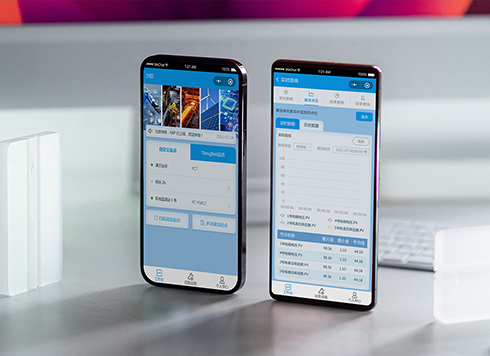 Likong Industrial IoT Tech Co., Ltd. Mini-program UI/UX Design
IIoT firms: mobile mini-program + platform. ...
-
 Livy Pig Farming IoT Platform UI Design
This IoT system uses sensors to monitor hog ...
-
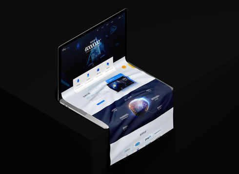 UI Design of the Internet Advertising Platform (a Sci-tech Sense Official Website)
The corporate website UI features a futuris ...
-
Is grey placeholder text mistaken for filled input because the hint looks too much like content, or because the field label has nowhere to sit?
Date: Nov 4, 2026 Read: 5
-
When users reach the third screen of a form and realize Save is still at the bottom, forcing them to scroll back and forth — should that button stay pinned to the screen?
Date: Nov 3, 2026 Read: 11
-
In the admin, I filter by status, open a ticket, then go back and the list resets to all—did the browser forget, or were the filters never saved?
Date: Nov 1, 2026 Read: 25
-
Bottom-of-page dropdown options show only partially when opened: is the popover not flipping up, or is it clipped by an outer container?
Date: Oct 31, 2026 Read: 30
-
The form is complete but the submit button is still gray and users keep clicking because they think it didn't save—are the disabled conditions unclear or is validation feedback lagging?
Date: Oct 30, 2026 Read: 43