




Is grey placeholder text mistaken for filled input because the hint looks too much like content, or because the field label has nowhere to sit?
Start with the conclusion: the light grey hint text inside an input box (placeholder) is suitable for explaining format, but not for doubling as a field label, and it must not serve as a default value. A more reliable approach in 2026 backend form delivery is: place the field label outside the input as an always-visible label, keep only one format example in the grey text, and make it visually clearly weaker than filled content; when the system provides a default value, fill in the real value directly and note its source or that it can be modified beside it. When users treat grey text as already filled in and only discover it is empty when they click submit, most of the time it is not user carelessness. The hint looks too much like real content, and the interface gives two contradictory signals in the same place.
When grey text is mistaken for filled input, the problem is that the visual signals are too similar
By default, placeholder text is light grey, uses the same font size as body text, and sits inside the input box. These three traits almost exactly overlap with “a short piece of light-coloured text has already been entered.” Users rarely read a form word by word when scanning it; they rely more on whether there are characters in the box to judge how far they have got. As long as there are characters in the box, a sense of completion is satisfied, and when scanning, they do not distinguish whether those characters are their own input or something the interface supplied.
Another cost sits on the accessibility side. Screen readers are not consistent in how they read placeholder text: some read it only once on focus, and some do not read it at all. Once a field label exists only in grey text, keyboard users and voice-input users cannot confirm which field they are filling in. This type of issue is a common deduction item in backend project acceptance checklists, and it can be checked item by item against accessibility standards or a team self-check list.
- Grey text uses the same font size as body text and differs only in colour, so it is visually equivalent to filled content;
- When an example is written in grey text (such as “e.g., Zhang San”), users may think they must fill it in exactly in that style;
- When a rule is written in grey text (such as “11-digit mobile number”), it disappears as soon as the field is focused and typing begins, and the rule can no longer be seen;
- Without an always-visible label, by the sixth or seventh field users have already forgotten what this field is for.
First separate the three things: field label, example value, and default value
The root of this kind of misjudgement is cramming three types of information with different responsibilities into the same place. The field label answers “what goes in this field,” the example answers “what format to use,” and the default value answers “what the system has already filled in for you.” Once the three are mixed, users cannot tell whether the characters in the box are their own input or a system preset, so the submitted result naturally does not match expectations.
- First settle where the field label belongs: always place the field label outside the input, either as a top label or a left label. Long forms favour top labels, and narrow screens do not need reflow; left labels suit table-style forms with short field labels and fixed column widths.
- Then judge whether an example is really needed: write one only when the format is not unique, such as for order numbers, ID numbers, or date formats; for fields with no format ambiguity, such as name, notes, or description, the grey text can be left empty.
- Next judge whether a system default value exists: if there is a default value, fill in the real value directly and note its source or that it can be modified beside it; do not use grey text to impersonate it. Grey text is not a value, and it is empty on submit.
- Finally settle where error messages go: place error copy on its own line below the input box, without covering or replacing the placeholder hint; otherwise, when users correct a mistake, they cannot see the original format example.
In terms of sequence, it is advisable to implement step 1 first. Once the field label has nowhere to sit, examples and default values parasitise the grey text, and users can only guess halfway through filling in the form. Conversely, once the field label has a permanent place, examples and default values each return to their proper place, and what remains is basically style adjustment work.
How the three common approaches compare, and which scale each suits
Common treatments in backend forms fall roughly into three categories: placeholder-only hints, floating labels (the label floats up on focus or after the field is filled), and external always-visible labels. They make different trade-offs between compactness and reviewability. There is no universal answer; the only question is whether they match the field scale and data-entry scenario.
- Placeholder-only hints: save one line of height, and are sufficient for single-field search boxes and filter conditions whose format is self-evident; but after input the field label disappears completely, and the risk rises clearly for data-entry forms with more than 8–10 fields.
- Floating labels: balance compactness and reviewability, and suit forms with a medium number of fields, mainly mobile use, and already tight row heights; the cost is that long field labels are easily compressed into a single line, so they need to be tested separately against the longest field label.
- External always-visible labels: keep the field label visible at all times, and are more stable for backends with multi-person shift entry and screen-reader and keyboard operation; each field takes up about one extra line of height.
Here is a rough comparison based on the typical range in actual 2026 delivery, to help align expectations in review meetings: placeholder-only hints take almost no extra time to implement, and overall form height stays unchanged, but after more than 10 fields, users’ review cost rises clearly; floating labels usually take 0.5–1 person-day for component changes plus regression; external always-visible labels add about one line per field, increase overall form height by roughly 15%–25%, and usually take 1–2 person-days for implementation and regression combined. These numbers vary with component-library maturity and field scale. They are only order-of-magnitude references, not commitments.
When choosing, ask only one question: after users fill in this field, do they need to look back at it again? If they do, the field label must be always visible; in a single-field scenario where users look once and submit, forcing in an extra line for a label becomes a burden.
When it fits, and when it does not need to be copied
The practice of placing field labels outside the input suits data-entry forms with more than 10 fields that need to be filled in stages or left and returned to midway, and also suits backends with multi-person shift operation where fields must be checked against records afterwards. It is especially needed in scenarios where field format is not unique and the cost of error is high (amounts, ID numbers, contract numbers), because users need to see the original format immediately when correcting a mistake. Such forms usually write “whether the field label is always visible” into the delivery checklist and go through it item by item as an acceptance criterion.
There are also cases where it is not necessary. A global search box at the top of the page is single-field, fixed in position, and self-evident in format, so a placeholder hint is enough; one or two input boxes in a filter area are used after a glance, so there is no need to add always-visible labels for them; the same applies to purely display-oriented small tool pages. The boundary can be compressed into one sentence: whether the field label is always visible depends on whether users need to look back after filling in the field; a single-field scenario where users look once and submit does not need to copy this practice.
At delivery: where the cost of one rework usually falls
In projects where the schedule is compressed to about two weeks and the materials are only a few sketches, a common situation is this: the front end implements the grey text directly as the label according to the design draft; during acceptance, the business side enters a real document once, and missed entries are concentrated after the sixth field. The rework is not copy changes but structural changes—adding always-visible labels, rearranging form height, and running validation regression again. The experience range is roughly 2–3 extra person-days, with the cost mainly falling on integration and regression rather than the design itself. This is also why it is advisable to settle field-label ownership before work starts rather than filling it in at acceptance.
- Cramming rules into grey text: the rule disappears as soon as the user focuses the field, which is the same as not writing it; rules should sit next to the label or below the input box.
- Using grey text to impersonate a default value: it looks filled in, but what is written to the database is an empty value, and later verification can only be patched manually.
- Grey text with too-low contrast: it may be barely visible on a computer, but is basically invisible when projected on a meeting-room screen, equivalent to no field label at all.
- Required markers written only in grey text: the marker disappears once the user starts typing, and users only learn the field is required when submission is blocked.
Frequently asked questions
Can the placeholder hint and the field label use the same sentence?
For a single-field search box, yes; for data-entry forms, it is not recommended. The field label needs to be always visible, while the placeholder hint disappears after input. When the two things are squeezed into one place, on a long form there is only an empty box left when users look back, and they have to fill it in from memory.
If the input box already has a default value, should a line of grey text still be left?
Usually not. Fill in the real value directly as the default and indicate its source. When grey text and a real value appear at the same time, users cannot tell which one will be submitted, and they may easily mistake a system-supplied value for something they filled in themselves.
Can floating labels be used in backend forms?
Yes, but first confirm that in the filled state the label remains visible and is not covered by the input content. In dense backends with compressed row heights, it is easy for the label to be squeezed into a single line; during acceptance, just run through it using the longest field label.
How light should the grey text colour be?
It should be legible while clearly weaker than filled body text; a common practice is two or three levels lower than body text. If it is illegible when projected or in low-light conditions, it is already too light, and the contrast should be rechecked against contrast guidelines.
If this form is about to go into development, proceed in this order: first take the field label out of the grey text, then decide which fields really need an example, and finally run validation once with the longest field label and once with the worst-case input length. Single-field scenarios with few fields that are filled only once do not need to copy this practice; forcing an always-visible label line into a search box becomes an extra burden instead.
-
 UI Design & Prototype for Sunwayland's ThingNet IIoT Platform
UI design and prototyping for ThingNet IIoT ...
-
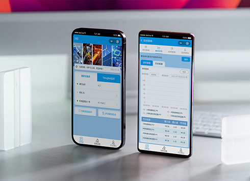 Likong Industrial IoT Tech Co., Ltd. Mini-program UI/UX Design
IIoT firms: mobile mini-program + platform. ...
-
 Livy Pig Farming IoT Platform UI Design
This IoT system uses sensors to monitor hog ...
-
 UI Design of the Internet Advertising Platform (a Sci-tech Sense Official Website)
The corporate website UI features a futuris ...
-
When users reach the third screen of a form and realize Save is still at the bottom, forcing them to scroll back and forth — should that button stay pinned to the screen?
Date: Nov 3, 2026 Read: 11
-
When support handles dozens of tickets a day, should the two or three most-used row actions move outside the “More” menu?
Date: Nov 2, 2026 Read: 17
-
In the admin, I filter by status, open a ticket, then go back and the list resets to all—did the browser forget, or were the filters never saved?
Date: Nov 1, 2026 Read: 25
-
Bottom-of-page dropdown options show only partially when opened: is the popover not flipping up, or is it clipped by an outer container?
Date: Oct 31, 2026 Read: 30
-
The form is complete but the submit button is still gray and users keep clicking because they think it didn't save—are the disabled conditions unclear or is validation feedback lagging?
Date: Oct 30, 2026 Read: 42