



When users reach the third screen of a form and realize Save is still at the bottom, forcing them to scroll back and forth — should that button stay pinned to the screen?
For the save entry point in a long form, measure field count and sectioning first, then decide where the button goes. Based on the typical 2026 back-office delivery standard: around 10 fields that fit on one screen — a single Save at the page end is enough; 15+ fields requiring two screens of scrolling — prioritize a sticky bottom action bar or sectional saving. With only one button at the page end, users often “finish filling and don't know where to click.” A sticky bar is not the default answer either: if the last item is covered or the button floats up when the mobile keyboard appears, and these two issues are not handled upfront, mis-taps become more likely.
The save button's position is really about whether the next step after filling is easy to find
In a long form, users' attention follows the input fields, and their gaze rests on the last field they filled. If the submit entry is off-screen, they either keep scrolling down, assume they haven't finished, or hit Back to look elsewhere. A common complaint in delivery is not that the button looks bad, but that “I filled it in for ages and couldn't find Submit” — which usually means reachability of the entry point was not included in the design scope.
A positioning issue can also escalate into a data issue: users think the submission failed, fill it in again, and the same record appears twice; or they are blocked by a leave confirmation when going back, and the filled content is lost. The test is straightforward — no matter where users scroll in the form, can the submit entry be seen or brought to mind within one screen? If not, the entry point is not arranged well.
- Visible does not equal reachable: a sticky bar pushed away by the keyboard or pressed under the bottom safe area still counts as invisible.
- Reachable also needs to be distinguishable: putting Save, Save and create new, and Reset in the same sticky bar with no hierarchy is the same as having no primary button.
- Timing of appearance matters too: when fields are few and scattered, sectional saving fits the filling rhythm better.
Measure fields first, then look at sectioning: three steps to decide between sticky bottom and page end
Many projects start by asking whether a sticky bottom or page end looks better — that skips judgment and goes straight to form. A more reliable delivery order is: measure fields, then check sectioning, then check submission cost. Run these three steps and the answer for position often emerges on its own.
- Count fields and scrolling screens: 8–12 fields that fit on one PC screen — a single button at the page end is enough; 15+ fields requiring about two screens of scrolling — then consider sticky bottom or sectional saving.
- See whether it can be sectioned by topic: natural groups such as basic information, contact information, and settlement information make sectional saving more reliable than sticky bottom; only when fields are strongly dependent and must be filled in one go does sticky bottom come into play.
- Check submission cost: if the submission can be edited or withdrawn afterward, the sticky bar can be more relaxed; if submission triggers irreversible actions such as an approval flow, outbound notification, or inventory deduction, leave clear confirmation cues next to the sticky bar, and don't make the button look like “Next.”
The point of these three steps is to map button position back to the filling rhythm. Few fields but heavy submission — the problem is confirmation; many fields but light submission — the problem is reachability. These two problems do not have the same solution.
Comparing four approaches side by side: the difference lies in revision rounds and integration effort
The same problem often has four paths, and the difference is not visual but in field scale, revision rounds, and development effort. The following is given as an experience range; specific projects still need adjustment based on actual fields and dependencies.
- Single button at page end: suitable for forms with up to 10 fields; low development and change effort, with a typical revision range of 0–1 rounds; reachability issues appear once fields increase.
- Sticky bottom action bar: suitable for forms with 15+ fields, strong field dependencies, and one-time submission; overlap, keyboard, and z-index need extra handling, and integration effort is one level higher than the page-end approach, typically 0.5–1 person-day more.
- Sectional saving: suitable for forms that can be naturally grouped by topic; the cost of user interruption is low, but you must additionally define whether partial saving counts as valid data, requiring one alignment round each for frontend and backend.
- Auto-draft plus explicit submission: suitable for scenarios where filling takes long and is easily interrupted; the draft must clearly state “saved temporarily, not yet submitted,” otherwise users will think it has already been submitted.
A common mistake is to stack all four: sticky bottom, sectional saving, and auto-draft at the same time. Two primary-button-like actions appear on one screen, and users don't know which to click. Approaches can be combined, but there should be only one primary submit entry in the entire flow; other actions should be reduced to secondary styles or tucked into a menu.
Where sticky bottom bars tend to go wrong
Sticky bottom bars are fairly common in 2026 back-office delivery, but adding a fixed bar is not the end of the job. Problems mainly cluster around overlap and z-index: the container lacks bottom padding, so the last row of input fields is pressed under the bar; when the mobile keyboard appears, the sticky bar floats up and covers exactly the field being filled; and when the page already has a pagination bar or bulk-action bar, the two stack and fight each other.
A common situation on delivery is: budget and timeline are tight, only a PC design is produced and then directly adapted to mobile, the sticky bar's padding and keyboard handling are not written into annotations, and frontend implements it with a fixed height. During acceptance, the client fills it in on a phone and finds that the last two items cannot be seen or tapped, leading to rework. As an experience range, this round of rework usually requires 1–2 days of design revision plus one regression test — considerably more expensive than writing clear annotations from the start. So before delivery, check three things: whether bottom padding is sufficient for the sticky bar's height, whether the bar hides or yields when the keyboard appears, and whether the bar contains only one primary action.
- No bottom padding: the last item overlaps the sticky bar — one of the more common and easier-to-fix issues.
- Keyboard appearance not handled: on mobile, when filling the last few items, the bar and keyboard compete for space, and users cannot see what they are typing.
- Too many buttons in the bar: Save, Reset, and Cancel side by side increase mis-tap rates, especially when Reset is adjacent to Save.
- Stacking with existing bottom elements: when list pages and detail pages each have their own bottom bar, first confirm which one yields.
What counts as acceptable
During acceptance, there is no need to argue about style. Going through a few verifiable criteria is enough; these can be written directly into the delivery acceptance checklist and checked with frontend.
- When scrolled to any position in the form, the primary submit entry is visible within one screen and not covered by overlays or the keyboard.
- The sticky bar keeps only one primary action; Reset and Cancel are clearly lower in visual weight than the primary action.
- Required-field validation results can locate the specific field and automatically scroll to the error position, without users having to search for it.
- Success and failure states after submission have distinguishable copy and do not share a single “Operation completed.”
- On mobile, test both keyboard-shown and keyboard-hidden states to confirm that the last item and the submit entry are both reachable.
Applicable scenarios and boundaries
When sticky bottom or sectional saving is appropriate: back-office data-entry long forms, where users need to fill more than a dozen items in a row, may be interrupted midway, and the submission action is relatively heavy. In such forms, entry reachability directly affects completion rate, so investing in handling overlap and the keyboard is worthwhile.
When it is unnecessary: forms with only five or six fields that can all be seen on one screen need just one button at the page end; forcing in a sticky bar adds a layer of visual noise. Detail pages focused on browsing and confirmation should not have a sticky action bar imposed on them just for consistency. Remember the boundary this way: only discuss sticky bottom when users must scroll to see all fields; if one screen fits, don't add it.
In addition, for irreversible submissions involving approval, deduction, or outbound notification, a sticky bar only solves “easy to find,” not “clicked by mistake.” Such scenarios need an extra confirmation before submission, or the submission result should be made into a traceable record; button position alone cannot be the fallback.
Frequently asked questions
If a form has only five or six fields, should it still use a sticky bottom save?
No. When there are few fields and one screen can show them all, a single button at the page end is cleaner; forcing in a sticky bar takes up an extra visual band and may conflict with the page's existing bottom bar.
Will a sticky bar cover the last item?
Yes, this is a fairly common issue. The container bottom needs sufficient padding for the sticky bar's height; before delivery, scroll to the bottom and test once to confirm the last row of input fields is fully exposed.
Does sectional saving mean splitting a long form into several pages?
Not the same. Sectioning can be blocks on the same page or separate steps; the key difference is whether each section counts as valid data in the system after saving. Align on this with the business side before starting.
Can auto-draft replace the save button?
No. A draft only prevents loss; it does not establish submission. The interface must clearly distinguish the two states — temporarily saved and submitted — otherwise users will think it has already been submitted.
If you are working on a back-office form with relatively many fields, first list the field count, number of scrolling screens, and submission cost, then decide between page end, sticky bottom, or sectional saving — this saves more effort than revising the design directly. Note that the criteria here are for data-entry forms; back-office pages focused on browsing, approval, or reconciliation need separate entry-design considerations.
-
 UI Design & Prototype for Sunwayland's ThingNet IIoT Platform
UI design and prototyping for ThingNet IIoT ...
-
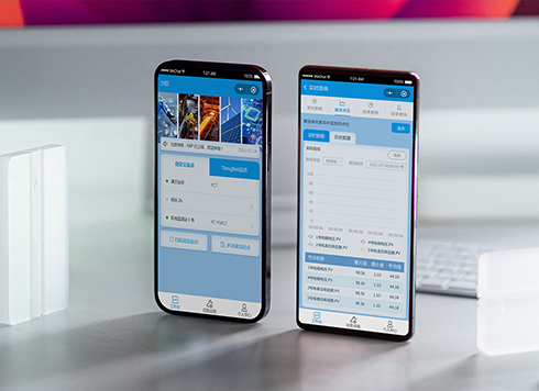 Likong Industrial IoT Tech Co., Ltd. Mini-program UI/UX Design
IIoT firms: mobile mini-program + platform. ...
-
 Livy Pig Farming IoT Platform UI Design
This IoT system uses sensors to monitor hog ...
-
 UI Design of the Internet Advertising Platform (a Sci-tech Sense Official Website)
The corporate website UI features a futuris ...
-
Is grey placeholder text mistaken for filled input because the hint looks too much like content, or because the field label has nowhere to sit?
Date: Nov 4, 2026 Read: 4
-
When support handles dozens of tickets a day, should the two or three most-used row actions move outside the “More” menu?
Date: Nov 2, 2026 Read: 17
-
In the admin, I filter by status, open a ticket, then go back and the list resets to all—did the browser forget, or were the filters never saved?
Date: Nov 1, 2026 Read: 25
-
Bottom-of-page dropdown options show only partially when opened: is the popover not flipping up, or is it clipped by an outer container?
Date: Oct 31, 2026 Read: 30
-
The form is complete but the submit button is still gray and users keep clicking because they think it didn't save—are the disabled conditions unclear or is validation feedback lagging?
Date: Oct 30, 2026 Read: 42