




Bottom-of-page dropdown options show only partially when opened: is the popover not flipping up, or is it clipped by an outer container?
When a row of dropdowns at the bottom of a page opens and only half the options are visible, users rarely think the interface is broken; most assume the field simply has only those few options. In 2026 admin delivery, a more reliable diagnostic order is: first check whether the popover is clipped by an outer container, then check how much space remains below the trigger and whether it needs to flip upward, and only then consider changing to a bottom drawer or inline expansion. In most field cases, one of the first two steps was missed, rather than the dropdown component itself being faulty.
First distinguish: clipped by an outer container, or popover not flipping up
The same symptom of not seeing all options usually has two causes. One is a space problem: the popover opens downward by default, the trigger is only a few dozen pixels from the viewport bottom, and the remaining options are naturally cut off by the screen edge. The other is a clipping problem: the popover is placed inside a parent container with overflow hidden or scrolling enabled, and the excess is swallowed by the parent; screen size matters little. This is common in table horizontal scroll containers, modal content areas, and Tab panels.
The way to tell is direct: make the browser window taller, or scroll the page to the middle, and open the same dropdown again. If it displays fully, it is basically a space problem; if it still shows only part no matter how tall the window is, it is likely clipped by an outer container. If this step is not clarified, later component swaps and z-index adjustments may be wasted work.
- Insufficient space: there is not enough available height below, so it needs to flip upward, or cap the height and allow internal scrolling.
- Clipped by an outer container: the parent overflow setting creates a clipping boundary, the popover cannot escape, and window size has little to do with it.
- Both combined: common for dropdowns inside table rows, which are both near the bottom of the page and inside a horizontally scrollable container.
Why missing one option often turns into a rework cycle
When a dropdown is cut off, users do not see an error; they see 'there are simply only these few options.' This misjudgment directly becomes wrong values and wrong forms, discovered only when reconciliation or approval is returned. In entry, reimbursement, and approval flows, one missed customer tier or expense category often means the whole form is returned and resubmitted, costing far more than an obvious red warning.
In one admin delivery, the constraints were tight budget and tight timeline, the design file only gave a static downward-expansion mockup, the front end implemented the component default positioning, and during acceptance the client clicked page by page on a small laptop; the bottom row of dropdowns popped off-screen as soon as it opened. We did not swap components first; we went through two layers uniformly: outer container and remaining space. We mounted fields that reused the same popover to the page root node, added a threshold to flip upward near the edge, and then added height capping and internal scrolling. The result was that the bottom area could expand fully, at the cost that the change spread across the site through component reuse, and regression testing had to cover the whole site. A single dropdown change looks small, but the effort had to be estimated as a site-wide popover change, with a typical range two to four times that of changing only one positioning rule.
- Invisible options do not throw an error; they are simply treated as not existing.
- To see everything, users often zoom the browser or scroll repeatedly, interrupting the task path.
- The issue is discovered at acceptance, when the change spreads across the site through component reuse.
Diagnostic order: outer container, remaining space, interaction fallback
Splitting it into three layers is because the three layers have different owners: the outer container is mostly page structure and styles, remaining space is popover positioning logic, and the fallback is an interaction choice. If the order is reversed, it is easy to keep changing the interaction layer while never escaping structural clipping.
- Outer container: confirm whether the popover mount point is inside an overflow container; check especially in tables, modals, and Tab panels; if necessary, mount the popover to the page root node, then recheck stacking and click-outside-to-close.
- Remaining space: on open, calculate available height above and below the trigger; if there is enough below, open downward, otherwise upward; when neither side is comfortable, cap the height first, then allow internal scrolling.
- Interaction fallback: for narrow screens or touch-first use, then consider a bottom drawer; if the options themselves exceed one screen, do not keep relying on flipping; reduce the options or add search.
Each layer has different cautions: for the outer container, watch whether changing the mount point introduces new stacking relationships; for remaining space, leave a threshold for flipping, and flip early when the trigger is too close to the viewport edge; for the fallback, ensure options can still scroll to the bottom when they exceed one screen, and that keyboard up/down keys can move item by item.
How to choose among approaches, and where the cost falls
Based on change surface and typical effort, you can roughly estimate a range to compare with the project schedule, then decide whether to do it and which one to do:
- Automatic flipping: the change is concentrated in one popover component, with a typical range of half a day to two person-days; suitable for projects that already have a component library and heavy page reuse; the cost is handling edge thresholds and scroll following.
- Bottom drawer: requires redoing interaction and styles, with a typical range of two to five days; more suitable for mobile-first scenarios where desktop has another entry point; the cost is often maintaining two implementations.
- Inline expansion: no popover, so no clipping problem, with a typical range of one to two days; the cost is that it pushes the layout taller, and other fields in the same row are prone to misalignment.
- Adjusting field position: move long dropdowns near the bottom upward by group, with almost no component change, but it requires changing information architecture and design files; communication and review typically range from one to three days; suitable when the form structure can be rearranged anyway.
Among these, simply increasing z-index is usually not in consideration: being clipped and being covered are different things. The former is a parent container boundary problem, the latter is a sibling stacking problem, and adding stacking cannot solve clipping. In 2026, many projects specifically review this kind of popover before acceptance, which is less troublesome than passive rework after launch.
Applicable and non-applicable boundaries
Not all dropdowns need flipping. For a filter bar with only three to five options and plenty of page space, fixed downward expansion is more predictable, and adding flipping only increases maintenance cost. What is truly worth handling are several positions: form rows near the bottom of the page, inside scrollable containers (table horizontal scrolling, modal content areas, Tab panels), and the visible area after the mobile soft keyboard appears.
Conversely, do not expect flipping to solve two cases: first, when the options themselves exceed one screen; flipping only solves direction, not information volume, and what is needed is height capping with scrolling, grouping, or search; second, when the popover contains linked selections and multiple contents need to be compared at the same time; in that case, change the hosting pattern rather than continuing to adjust positioning.
- Acceptance criterion one: at common laptop resolutions and scaling, a dropdown in the bottom row can expand fully, or can scroll to see all options.
- Acceptance criterion two: after opening, it does not cover the current value in the trigger, so users can select while comparing.
- Acceptance criterion three: after clicking outside to close, focus returns to the trigger and the page position does not jump.
- Acceptance criterion four: on mobile, opening does not throw the page around, and after closing the scroll position stays as it was.
A common counterexample is that after opening, the popover drifts with page scrolling; users scroll and click while option positions keep changing. This is usually not a missing flip, but the popover using absolute positioning without updating position on scroll; it can be reproduced by scrolling and clicking once during acceptance.
FAQ
If a dropdown is clipped by a table container after opening, does adding z-index help?
Mostly no. Clipping happens at the parent overflow boundary, and stacking order cannot override it; either render the popover mounted to the page root node, or adjust the container overflow setting, then check whether stacking needs to be rechecked.
If the expansion direction jumps back and forth, will users feel the interface is shaking?
Yes. So set thresholds and hysteresis, add a little margin before flipping near the edge, and prefer flipping early upward rather than letting the popover switch back and forth between two directions.
If there are too many options to fit on one screen, is flipping still worth doing?
It only solves direction, not information volume. A common approach is height capping plus internal scrolling, then adding search or grouping beyond a certain number of items, reducing the options themselves.
On mobile, is it simpler to just switch to a bottom drawer?
In touch scenarios a bottom drawer is handier, but desktop usually needs another implementation. For projects where both ends share the same pages, automatic flipping is often more cost-effective first.
How can I quickly tell whether it is insufficient space or clipping by an outer container?
Make the window taller or scroll the page to the middle, then open the same dropdown. If it displays fully, it is mostly a space problem; if it always shows only part, it is likely clipped by an outer container.
Next time a dropdown cannot show all options, first reproduce it in three steps: make the window taller, scroll to the middle, and switch to a small screen. Determine whether it is insufficient space or clipping by an outer container, then decide whether to change positioning or change the container. This order applies to bottom-of-page areas, inside scrollable containers, and mobile soft-keyboard scenarios; if the options themselves exceed one screen, prioritize reducing options rather than continuing to adjust the flip direction.
-
 UI Design & Prototype for Sunwayland's ThingNet IIoT Platform
UI design and prototyping for ThingNet IIoT ...
-
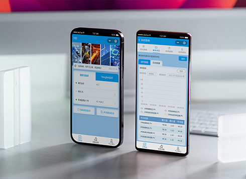 Likong Industrial IoT Tech Co., Ltd. Mini-program UI/UX Design
IIoT firms: mobile mini-program + platform. ...
-
 Livy Pig Farming IoT Platform UI Design
This IoT system uses sensors to monitor hog ...
-
 UI Design of the Internet Advertising Platform (a Sci-tech Sense Official Website)
The corporate website UI features a futuris ...
-
Is grey placeholder text mistaken for filled input because the hint looks too much like content, or because the field label has nowhere to sit?
Date: Nov 4, 2026 Read: 4
-
When users reach the third screen of a form and realize Save is still at the bottom, forcing them to scroll back and forth — should that button stay pinned to the screen?
Date: Nov 3, 2026 Read: 10
-
When support handles dozens of tickets a day, should the two or three most-used row actions move outside the “More” menu?
Date: Nov 2, 2026 Read: 17
-
In the admin, I filter by status, open a ticket, then go back and the list resets to all—did the browser forget, or were the filters never saved?
Date: Nov 1, 2026 Read: 25
-
The form is complete but the submit button is still gray and users keep clicking because they think it didn't save—are the disabled conditions unclear or is validation feedback lagging?
Date: Oct 30, 2026 Read: 42