




In an Admin Table, the Cell Is Blank—Support Asks Whether No One Filled It In or It Failed to Load. What Exactly Is the Difference Between a Blank and a Dash?
Quotable conclusion: A blank cell in a table can represent four states: nobody has filled it in, the field does not apply to the current record, the current account has no permission to see it, or the API did not return it / partial loading failed. Under the common 2026 admin delivery convention, only a confirmed 'not applicable' case should get a dash; 'unfilled' and 'no permission' should be distinguished with light-colored hints, text, or permission states; loading failures should show an explicit error and a retry entry. It is not appropriate to let a single blank cover all four cases, otherwise users can only guess and customer support can only keep asking.
One blank cell carries at least four states
A blank in an admin list has only one visual appearance, but underneath it falls into at least four categories. The judgment order can be simple: first ask whether, from a business perspective, this field should have a value for this record. If it should but is blank, it is most likely unfilled, not permitted, or a loading problem; only if it should not have a value does it count as 'not applicable.' If this step is not clear, whatever is filled in later is just a blank in a different form.
- Unfilled: The field allows empty values, the user left it blank, and it can be filled in later.
- Not applicable: It does not apply in business terms, e.g., a purely offline order has no logistics tracking number, or an internal transfer has no customer name.
- No permission: The field has a value, but the current role cannot see it; it exists but is not shown.
- Not returned or failed to load: The API omitted the field, timed out, or a partial request failed; this is a system-side problem.
Delivery reality: the cost of blank values often lands in post-launch explanations
At least when something is filled in incorrectly, you can see that there is content, verify it, and fix it; leaving it blank shifts the judgment burden to the person viewing the page. This is even more obvious in reconciliation scenarios: if several rows in a logistics tracking number column are blank, finance cannot tell whether the order has not shipped yet or whether it uses self-pickup, and in the end can only ask one by one. This cost usually does not appear in the development schedule; it only appears in post-launch communication.
A common situation in delivery is: budgets and schedules are tight, the field list is often completed only before integration testing, and the API response mixes null, empty string, and the entire field being missing. The front end then conveniently renders all three as blank. Our approach is to first divide fields into required, nullable, and not applicable based on whether they should be filled in for business reasons, and then unify the rendering rules for blank values. The cost is spending about half a day to a day confirming the meaning of each field with the business side; this is an experience range. The benefit is that after launch there is a noticeable drop in support tickets with screenshots asking 'is this cell broken?', and fewer cases of exported data being treated as missing fills and patched with data that should not be added.
- Customer support sees a blank, assumes it is a system exception by default, and runs through a troubleshooting process.
- After export to Excel, blank columns are treated by the business side as missing values, and a batch of data that should not be filled in is added later.
- Report statistics treat blank values as 0 in calculations, distorting both the mean and the median.
In what order should the four states be determined?
The reason for splitting along the two dimensions of 'should it have a value' and 'can it be seen' is that they directly determine what the user should do next: fill it in, safely ignore it, request permission, or refresh and retry. If you split by another dimension, users still will not know what to do after the split.
- First determine whether the field is required: A blank value in a required field is essentially an anomaly and should go through validation or show an error; it should not quietly appear as blank.
- Model not-applicable cases explicitly: This step needs confirmation with the business side and should not be guessed by the front end from the field name; confirmed not-applicable scenarios should be rendered uniformly as a dash.
- Render permission states separately: For values that exist but cannot be seen, state 'no permission' clearly or show a clickable permission explanation; do not share the same style as no data.
- Load failures must show an error and be retryable: For partial failures, showing a failure state and retry entry in the cell is less troublesome than a full-page spinner and is less likely to be misread as empty data.
The caution for each step differs: Step 2 is easy to skip because confirming field meaning does not look like productive work; Step 3 must align with the role-permission table, otherwise the same row of data may look inconsistent in quantity under different accounts; the key to Step 4 is distinguishing an empty result from a failed request. These two look very different to users, yet in code they differ by only one check.
How do blank, dash, 'not available,' and 0 compare as notations?
These four notations are not absolutely right or wrong; they only have conditions where they apply. Before choosing, look at three things: roughly what proportion of the column is blank, whether the table is for scanning or checking, and whether the column will be exported or used in statistics. Under common 2026 admin delivery practice, they can be divided as follows:
- Pure blank: Suitable for wide tables with many fields and a low proportion of blank values (a typical range is within 10%), for a cleaner visual; the cost is that users cannot distinguish no value from failed loading.
- A single dash: Suitable for data tables mainly used for scanning; it clearly conveys that the system read this record and only this field has no value. In high-density tables, it interrupts the line of sight less than text.
- Text such as 'Not available': Suitable for detail pages where only one record appears per screen, where explaining the cause matters more; placed in a table with a dozen or twenty rows per screen, it becomes noise.
- Filling in 0: Valid only for numeric fields where 0 itself is a real business value. Using 0 in place of blank values distorts totals, averages, and year-over-year comparisons, and is one of the more costly rework cases in this type of problem.
If unfilled and not applicable both appear in one table, a common combination is: a dash for not applicable, lighter-colored hint text for unfilled, fixed copy for permission states, and a retry option for failure states. The four notations coexist so that users can determine the next step without asking someone, not for decoration.
Which tables are worth distinguishing four states, and which are not
Scenarios suitable for carefully distinguishing the four states include: admin systems shared by multiple roles, lists that need to be exported for external reconciliation, report pages with statistical summaries, and industry fields whose meanings are easily misunderstood, such as amounts, order numbers, dates, and statuses. The common feature of such pages is that one blank triggers cross-role follow-up questions.
The boundary for not needing this approach is also clear: when the total number of fields is in the single digits, only one role uses it, or it is a purely internal temporary tool or one-off export table, a single dash is enough; forcing four-state distinction only increases development and subsequent maintenance costs. The purpose of blank-value handling is to let people understand without asking someone; once this cost is higher than the communication cost, it is time to stop.
What to check on one screen during acceptance
The criteria do not need to be complex, and you do not need to wait for full data. Check one screen with a dozen or twenty rows covering three to five role accounts, and the problems will basically become visible.
- Randomly sample 10 rows; for each row, the blank value can be identified as one of the four states without asking a developer.
- For the same field under different roles, blank, no permission, and dash do not blend into the same appearance.
- When the network is disconnected or the API reports an error, the cell shows a failure hint instead of quietly becoming blank.
- Blank values in exported files match the page convention, and the header or notes explain them.
FAQ
In an admin table, can blank cells all be replaced with a single dash?
As long as the column has a single business meaning and can only mean 'not applicable,' a dash is enough; if it may also be unfilled or restricted by permissions, one dash will keep the four cases mixed together.
Should blank values and 0 be displayed separately in a table?
Yes. 0 is a real value and participates in totals and year-over-year comparisons; blank values do not participate in calculations. If the two are mixed, reports and reconciliation are prone to distortion, especially in numeric columns.
For fields that the current role cannot see, should they be left blank or should the whole column be hidden?
When the entire column is not viewable, hiding the column is cleaner; when only some rows in the same column are restricted, leaving them blank is easily treated as no data, so writing 'no permission' is safer.
How should blank cells be handled after exporting to Excel?
Define the convention before export: leave unfilled as blank, write a dash for not applicable, and note the meaning in the header or a description row, so the business side does not treat blanks as missing values and later add a batch of data that should not be added.
If this table will be shown to others, exported, or checked across roles, it is worth spending half a day to a day defining field meanings and blank-value conventions; if it is only an internal tool for a quick temporary check by yourself, a single dash is already enough. These steps are usually put into the field confirmation checklist before integration testing and reviewed together with the permission table, which is less troublesome than patching after launch.
-
 UI Design & Prototype for Sunwayland's ThingNet IIoT Platform
UI design and prototyping for ThingNet IIoT ...
-
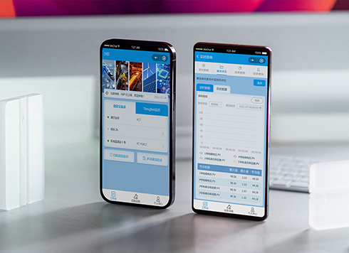 Likong Industrial IoT Tech Co., Ltd. Mini-program UI/UX Design
IIoT firms: mobile mini-program + platform. ...
-
 Livy Pig Farming IoT Platform UI Design
This IoT system uses sensors to monitor hog ...
-
 UI Design of the Internet Advertising Platform (a Sci-tech Sense Official Website)
The corporate website UI features a futuris ...
-
In an admin form, the postcode box and address box are the same width—after six digits, users pause for the next one. Should short fields be narrowed or kept at full-column width?
Date: Nov 22, 2026 Read: 5
-
On mobile admin screens, why do icon buttons take two taps—should I make the icons larger or expand the tap target?
Date: Nov 21, 2026 Read: 9
-
Why does the list flash “no results” while the pinyin for “customer” is still in the candidate box?
Date: Nov 20, 2026 Read: 14
-
When a backend toggle applies on flip, and a wrong permissions change means digging through logs to revert each one, does instant apply give back the clicks it saves?
Date: Nov 19, 2026 Read: 20
-
The onboarding registration form has only about ten fields, but splitting it into three steps makes it slower to complete—new hires leave to get documents, come back, and cannot find where they left off. Who is this step-by-step form actually helping?
Date: Nov 18, 2026 Read: 19