



The save toast in the top-right disappears in a flash and users later ask again whether it saved—is it staying too short?
Conclusion first: How long a toast stays depends less on whether the fade-out animation is smooth and more on whether the user can still check that information afterward. Under the common 2026 delivery baseline for admin backends, a 2–4 second toast is enough for actions whose result is immediately visible and can be checked again; when data is changed but the result is not visible on the current screen, or when a bulk process needs later confirmation, the toast is only a supporting cue and the main feedback should go to list status, operation logs, or task lists. Failures, amount or permission changes, and audit-trail actions should not rely only on an auto-dismissing toast.
1. Why does a toast that floats by turn into a second confirmation?
A toast does not block the operation, dismisses automatically, and takes little layout space. It suits telling the user that the action just now succeeded; it does not suit carrying information that the user must know. Putting the latter into an auto-dismissing container shifts the cost of confirmation back to the user.
There are three common paths by which users miss a toast: their gaze is on the lower half of the form, they switch windows midway, or they are staring at the list looking for that record. After missing it, users often do not just let it go; they click Save again or turn to a colleague and ask. One toast that fails to catch the moment can lead to an extra duplicate record on the backend and an extra support question about whether it was saved; the typical range for troubleshooting and cleanup depends on whether deduplication and logs exist.
- The point of toast duration is not to let people read it through, but to cover the glance back.
- The attention saved by non-blocking feedback is usually paid back later in a second confirmation.
2. Grade by consequence: four feedback types and experience ranges for duration
The basis for grading is not the control style but two questions: Is the operation result visible on the current screen? Can it be undone after a mistake? Grade first, then choose the control, to avoid a single success toast for every action.
- Immediately visible and reversible (editing a note, toggling a switch, changing sort order): a 2–4 second toast is enough; if the page state has already changed clearly, it may not need a toast at all.
- Immediately visible but irreversible (submitting for review, publishing an announcement): the toast should include the action name and provide a short undo entry; the typical range is 5–8 seconds, and the new status should be visible in the list immediately.
- Result not on the current screen (bulk export, asynchronous generation): the toast should only say Submitted; the actual result is checked in the task list or progress bar. A common pitfall is writing Submitted as Completed.
- Failure that needs user action: do not use an auto-dismissing toast; use a persistent inline message or top banner that states which item failed and whether it can be retried.
If the undo entry for the second tier is placed in the toast, then if the toast is covered or accidentally closed, the undo is effectively invalid, and the only remaining fallback is to change it again on the detail page. During delivery, confirm that this path really exists.
Comparable options (approaches and experience ranges):
- Adjust the toast only: 2–4 seconds, avoiding fixed elements; the typical change-effort range is about half a day to 1 day, suitable when the result is visible on the current screen and reversible.
- Toast plus inline status or undo entry: 5–8 seconds and keep a path to change it back on the detail page; the typical change-effort range is about 1–3 person-days, suitable when irreversible but visible on the current screen.
- Toast plus task list or operation log: the toast only reports Submitted, and the result is checked in the task list or log; the experience range for change effort is about 2–5 person-days depending on existing logging capability, suitable for bulk, asynchronous, and audit-trail actions.
These three tiers are not better when heavier; choose what is sufficient. Choosing too heavy adds page burden and implementation cost, while choosing too light means users will come back asking.
3. Delivery scene: where position, stacking, and copy often get stuck
In projects with tight timelines and limited budgets, frontend teams often use component-library defaults and place the toast at top center or top right. A common scene: a bulk action on twenty or thirty records produces toast after toast stacking up, covering the filter bar and row actions, and during client acceptance two clicks reveal that the filter cannot be clicked. The usual fix is to merge operations within the same second into a count, move the toast layer away from fixed bars, and send failure details to a result panel; the cost is adjusting z-index, changing position, and one round of regression testing, with an experience range of about half a day to one day. This cost is not large, but if it is found only at acceptance, it often squeezes the later integration testing time.
At the copy level, the four words Operation successful carry very little information. For the same save, Saved 3 items; item 4 was not saved because stock was empty is much more useful than Operation successful, because it directly tells the user what to do next. In project delivery, toast copy is reviewed together with error copy to avoid success and failure wording fighting each other.
- The position should avoid the main action area, fixed filter bars, and fixed bottom buttons.
- Repeated operations within the same second should be merged into a count, not stacked one by one.
- The toast layer must not swallow clicks on the layer below, otherwise it covers exactly what the user needs to click next.
- Do not use green for failure or red for success; color is only auxiliary, and the text must make the result clear.
4. How do you judge whether a toast is acceptable?
At acceptance, rather than looking at animation, check item by item against the following. Meeting these is acceptable; missing one leaves room for users to come back asking. Common counterexamples for what fails are included as well.
- State clearly what was done: put the action name and the count in the copy. Counterexample: one Operation successful for every scenario.
- Position does not block operations: while the toast is visible, filters, row actions, and bottom buttons are still clickable. Counterexample: the toast covers the pagination.
- Failures do not auto-dismiss: error messages stay until the user handles or closes them and can be read by screen readers. Counterexample: validation failures also use a 3-second toast.
- Keep only the latest one on the same screen: consecutive operations are merged into one toast with a count, and stacking should not exceed two or three.
- Do not press against the bottom on mobile: on mobile, the toast should avoid the fixed bottom button area and leave room for the safe area.
These checks can be excerpted independently as an acceptance checklist; among them, Failures do not auto-dismiss is the easiest to miss because it is not easy to trigger during a demo.
5. Applicable scenarios and boundaries
When a toast is suitable: the operation result is immediately visible on the current screen, and the user can check or undo it themselves, such as editing a note, toggling a status, saving a single item, or copying to clipboard. In these scenarios, a toast is less troublesome than a modal and does not interrupt continuous entry.
When it is unnecessary or should not be used: when the user must make a choice (overwrite or not, sync or not), when amounts or permissions change, when bulk results contain partial failures, and in audit scenarios where a record must be kept. Feedback in these scenarios should either be persistent or go into the operation log; do not count on a line of text that disappears automatically. The boundary can be excerpted independently as one sentence: For any operation that must later be reconstructed from memory, an auto-dismissing toast is not enough.
Also distinguish the product audience: for internal-employee-facing admin backends where results can be checked, it is appropriate to add feedback according to the grading above; for short-flow pages facing external users, the toast should be lighter instead, and the interface should not be made too heavy just to keep a trail. This boundary is still often mixed together in 2026 delivery discussions, so it is best to state it separately during review.
FAQ
How many seconds should a save success toast usually stay?
When the result is already visible on the current screen, 2–4 seconds is the typical range; with an undo entry it can be extended to 5–8 seconds, and after it expires there must still be a way to change it back on the detail page.
Should the toast go in the top-right or top-center?
Look at the main action area and fixed elements. When the form is toward the top, top-right is more stable; on a list page, top-center is easily covered by the filter bar, so the position should leave room for fixed bars and bottom buttons.
Should a successful bulk operation show one toast per item?
No. A single toast with a count is clearer, for example Processed 18 items, 2 failed; put failure details in the result panel or operation log.
Is a toast enough for an action like deletion?
No. Deletion is irreversible, so a toast can only provide follow-up feedback; there must be at least one of prior confirmation or short-term undo. If both are missing, users can only check from memory.
Can a toast replace an operation log?
It cannot replace it. A toast is suitable for immediate notice, while later checking depends on the operation log or task list; for actions involving amounts, permissions, and auditing, the record should be the main feedback.
If your admin backend also has the situation where users click Save and then ask again whether it was saved, start with two places: bulk operations and failure messages. Replace auto-dismissing messages with persistent ones, and replace Operation successful with copy that includes the action name and count. This baseline suits admin backends where results can be checked and page state is clear; for short-flow pages facing external users, the toast should be lighter instead, and the interface should not be made too heavy just to keep a trail.
-
 UI Design & Prototype for Sunwayland's ThingNet IIoT Platform
UI design and prototyping for ThingNet IIoT ...
-
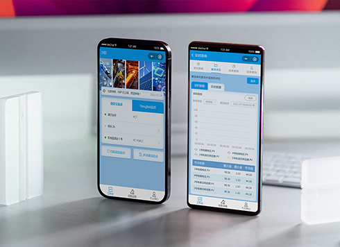 Likong Industrial IoT Tech Co., Ltd. Mini-program UI/UX Design
IIoT firms: mobile mini-program + platform. ...
-
 Livy Pig Farming IoT Platform UI Design
This IoT system uses sensors to monitor hog ...
-
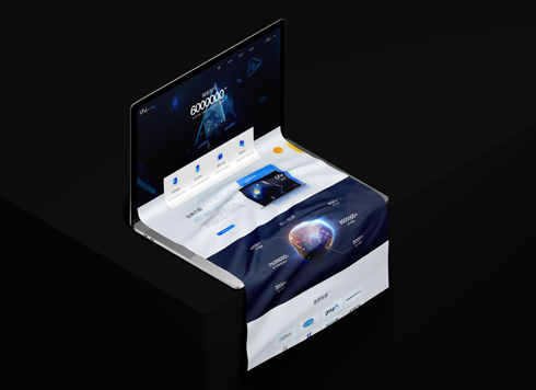 UI Design of the Internet Advertising Platform (a Sci-tech Sense Official Website)
The corporate website UI features a futuris ...
-
If a save-success toast only flashes once, will users think they missed the tap?
Date: Sep 20, 2026 Read: 78
-
In an admin form, the postcode box and address box are the same width—after six digits, users pause for the next one. Should short fields be narrowed or kept at full-column width?
Date: Nov 22, 2026 Read: 4
-
On mobile admin screens, why do icon buttons take two taps—should I make the icons larger or expand the tap target?
Date: Nov 21, 2026 Read: 8
-
Why does the list flash “no results” while the pinyin for “customer” is still in the candidate box?
Date: Nov 20, 2026 Read: 13
-
When a backend toggle applies on flip, and a wrong permissions change means digging through logs to revert each one, does instant apply give back the clicks it saves?
Date: Nov 19, 2026 Read: 19