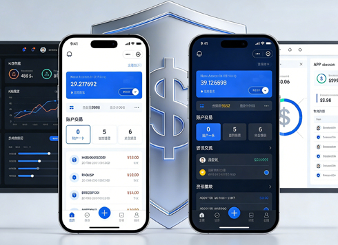




When users scroll past a dozen rows in a long admin table and can no longer tell whether a column is amount or quantity, should the header stay pinned to the top?
Whether the header should stay pinned to the top does not depend on whether the table is long. It depends on whether users still need to compare the same column across rows as they scroll down. A common 2026 admin delivery rule of thumb: when there are 6+ columns, the data extends beyond one screen, and users need to compare numbers across rows within a column (amount, quantity, time), pinning the header has clear benefits. Conversely, for a 3–5 column list that users scan once and leave, pinning only wastes vertical space.
First distinguish whether users are 'reading one row' or 'comparing one column across rows'
There are two common ways to read an admin table. One is 'reading one row': the user locates a record by order number or name, scans two or three fields horizontally, and clicks into the details. The other is 'comparing one column across rows': the user compares amounts, quantities, or time differences vertically on the same screen, for example in reconciliation, stocktaking, or checking status distribution. Whether the header is pinned has real value only for the second way of reading; for the first, it is mostly decoration.
The distinction is not difficult: look at how long users stay on the page and whether they scroll up and down repeatedly. Support agents handling tickets usually stay only ten to twenty seconds, which is 'reading one row'; finance staff doing reconciliation may stay for several minutes, going back and forth across a dozen rows, which is 'comparing one column across rows'. The two types of pages often coexist in the same system, and there is no need to force them into one approach.
- 'Reading one row' scenarios: to-do lists, message centers, ticket queues; pinning the header has limited benefit;
- 'Comparing one column across rows' scenarios: reconciliation, inventory transactions, operation logs; pinning the header has clear benefit;
- Criterion: after scrolling past the header, do users still need to recall column meanings from memory—if they do, pinning can reduce misreading.
A practical decision order: 'three checks and one measurement'
When moving a project forward, I usually ask four questions in order: the first three determine whether to pin, and the last determines how tall the pinned area should be and whether to pin the first column as well. If the order is reversed, teams tend to jump into visual details first and only after a long discussion realize that the page does not need pinning at all.
- Check the column count: the experience range is that only with 6+ columns is it worth using height for a pinned header; with 3–5 columns, users can usually still remember the field names;
- Check whether the data crosses the screen: one screen typically shows 10–15 rows, and only when the data volume exceeds that level does the 'header scrolls away' problem really exist;
- Check whether cross-row comparison is needed: when users need to compare values, statuses, or dates across rows in the same column, pinning has the highest value; for lists that are purely 'click in to see details', it can be skipped;
- Measure the height cost: a sticky header is typically 36–48px tall, and after adding the filter area and toolbar, the screen shows about 1–2 fewer rows. Whether that is acceptable should be weighed as 'losing these two rows in exchange for fewer misreads'.
If questions 2 and 3 are both true, pinning is generally justified; if only one is true, then check whether this is a high-dwell-time page. The criterion can be put in one sentence: can this page be described as one where, after the header scrolls away, users can only rely on memory to identify columns? If so, pinning is worth it.
No pinning, header only, and header plus first column: comparing three approaches
The real choice is not a binary 'pin or not pin'; there are commonly three forms, with quite different costs. Below is an experience range by use case, implementation cost, and common pitfalls, which can be used directly in reviews. These are typical ranges, not precise quotes; the specific cost depends on the component library and the existing table structure.
- No pinning (normal scrolling): lowest implementation cost; changes are limited to the table container; suitable for 3–5 column scan-and-leave lists; the pitfall is that after scrolling to a dozen rows in a long table, users rely on memory to recall column names.
- Header only: medium cost, typically half a person-day to two person-days; requires handling container height, horizontal scroll synchronization, and consistent column widths between header and content; suitable for 6–10 column tables that need vertical comparison of numbers; the pitfall is unsynchronized horizontal scrolling, which misaligns as soon as the user drags.
- Header plus first column: higher cost, typically one to three person-days; requires handling the layers, shadows, and boundary lines of two-level fixed areas; suitable for reconciliation and stocktaking pages with 'order number or name + multiple numeric columns'; the pitfall is that on narrow screens the first column eats up width, leaving only two visible columns in the body area.
All three approaches can be valid; the key is consistency within the same system: pages of the same type should preferably use the same reading pattern, otherwise users will repeatedly check between two lists whether 'the header on this page will follow along', and that repeated checking is itself a hidden cost.
Delivery in practice: the two rows you save often come at the cost of rework
A reconciliation page built in 2026 had these constraints: the schedule was compressed to three weeks, the component library was ready-made, the filter area already took up nearly one-third of the screen height, 4 of the table's 11 columns were amounts, and only 9 rows fit on one screen. At the time, to show two more rows, we did not pin the header first, and the review passed smoothly.
On acceptance day, finance staff scrolled to row twelve or thirteen and began mistaking 'accounts receivable' for 'actual receipts'. The issue was pointed out on the spot, so we had to go back and add the sticky header, with one or two rounds of revision, and also redo column-width synchronization between header and content. The experience range is roughly this: when visible rows per screen are squeezed below 10 and the table has more than 8 columns, a sticky header is basically unavoidable; the one or two rows saved earlier usually come back as one or two rounds of rework later. Conversely, the typical range is a 3–5 column list that fits on one screen; adding pinning instead makes users complain that 'I can only see a few items per page'.
So the decision is best made before implementation: first measure the column count and rows per screen, then check whether users will repeatedly compare the same column on this screen. If both are true, do not skip this step.
When it applies and when it does not
A sticky header is not a default setting for admin tables; it solves a specific problem: users need to keep identifying column meanings while scrolling. Treating it as a universal style and applying it to every list will instead squeeze out the rows that actually need to be shown.
- Suitable for: long reconciliation, stocktaking, and log tables; 6+ columns; need for cross-row comparison of values; longer page dwell time;
- Not necessary: simple 3–5 column lists; data that fits on one screen; workbenches where every row is clicked into for details; narrow mobile screens (too few visible columns after pinning);
- Compromise: make the header stick only after scrolling beyond a certain distance, while keeping the first screen in normal layout, balancing visual cleanliness and identification needs.
The boundary can be written as a quotable sentence: only when the statement 'after the header scrolls away, users can only rely on memory to restore column names' is true is pinning worth it; otherwise, pinning just trades visible area for a feature nobody uses. In 2026 delivery practice, this kind of decision is best put in writing during design review, rather than left for debate at acceptance.
FAQ
After pinning the header, what if it misaligns during horizontal scrolling?
In most cases, the header and the content use separate scroll containers, so two sets of widths are calculated independently when dragging horizontally. The fix is to make them share the same horizontal scroll container, or drive the header column widths from the actual content widths, and check this together at acceptance.
Should a table with only four or five columns also have a sticky header?
Usually not. With four or five columns, field names are easy to remember, and pinning instead takes up one or two rows of visible area on the screen. For such lists, it is more worthwhile to tighten row height and move key columns forward.
If the header is pinned, will it be too cramped on mobile?
On narrow screens, a pinned header plus a fixed first column will take up most of the screen width. A common approach is not to pin the header on mobile, but instead include field names in each row, or replace the table with a card list.
Can a sticky header and column-width memory interfere with each other?
Yes. After users drag column widths, the header must be redrawn using the same width data; otherwise columns misalign as soon as the user drags. At delivery, these two things should be checked together in the same acceptance pass.
If your admin system is about to add a sticky header, start with one small step: open the list pages that have been complained about in the last three months, see whether users are 'reading one row' or 'comparing one column across rows', and then decide whether to pin and which layer to pin. Xiyue Company usually goes through this pass before starting work in admin delivery as well. The boundary is clear: for lists with few columns, data that fits on one screen, and navigation-oriented use, there is no need to pin the header just for visual tidiness.
-
 UI Design & Prototype for Sunwayland's ThingNet IIoT Platform
UI design and prototyping for ThingNet IIoT ...
-
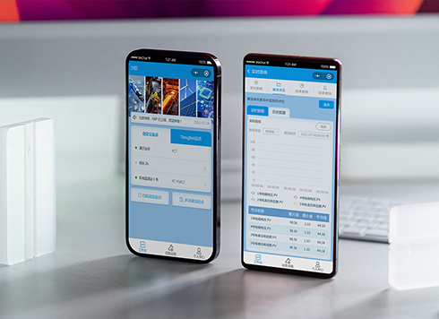 Likong Industrial IoT Tech Co., Ltd. Mini-program UI/UX Design
IIoT firms: mobile mini-program + platform. ...
-
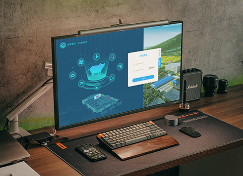 Livy Pig Farming IoT Platform UI Design
This IoT system uses sensors to monitor hog ...
-
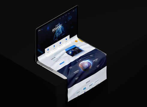 UI Design of the Internet Advertising Platform (a Sci-tech Sense Official Website)
The corporate website UI features a futuris ...
-
Admin table action buttons always need scrolling to the far right — too many columns, or just the wrong order?
Date: Sep 12, 2026 Read: 86
-
In an admin form, the postcode box and address box are the same width—after six digits, users pause for the next one. Should short fields be narrowed or kept at full-column width?
Date: Nov 22, 2026 Read: 7
-
On mobile admin screens, why do icon buttons take two taps—should I make the icons larger or expand the tap target?
Date: Nov 21, 2026 Read: 10
-
Why does the list flash “no results” while the pinyin for “customer” is still in the candidate box?
Date: Nov 20, 2026 Read: 16
-
When a backend toggle applies on flip, and a wrong permissions change means digging through logs to revert each one, does instant apply give back the clicks it saves?
Date: Nov 19, 2026 Read: 21