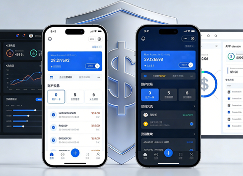




On mobile, if the order list shows only order number and status, and the amount appears only after swiping right, will users think the order has no amount?
When right-side columns in a mobile admin order list are pushed off screen, do not first choose between “adding a horizontal scroll hint” and “switching to cards.” Based on common 2026 delivery practice, the order of judgment is: first see whether users on this screen are finding an order or checking line by line, then see how many columns a row must show at once and how many inline actions there are; for 3–5 columns with finding orders as the main task, you can keep horizontal scrolling, fix the first column, and add edge fading; for more than 8 columns or line-by-line checks of multiple fields, summary cards plus a detail page are more stable. The problem is usually not the small screen, but that column priority has not been rearranged for mobile scenarios.
1. What gets pushed off screen is not just the right-side columns
Horizontal overflow is usually not just “the table is too wide.” Desktop table columns expand according to content; on screens 375–430 pixels wide, order number, customer, amount, status, and actions get squeezed into the same row; when users cannot see the right side, they assume the row contains only that information. The bigger trouble is that horizontal swiping and vertical page scrolling share the same area, so gestures easily conflict.
To judge whether this really needs handling, first measure two numbers: how many columns are fully visible on the first screen, and what proportion of the screen width the horizontal scroll distance takes. If the first screen shows only order number and status, while amount and customer are off screen, and customer service needs to check by amount every day, this cannot be fixed by “adding a hint.”
- Sense of missing information: the right-side columns have no edge fade and no scrollbar, so users do not know they can still swipe.
- Broken comparison: amount and status in the same row are split across two screens, raising the cost of horizontal comparison.
- Hidden actions: row-end action buttons sit at the end of horizontal scrolling, and users cannot find reassign or view.
2. Separate tasks first: finding an order and checking an order are not the same interface
For the same order list, customer service on mobile is mostly “finding one order”: they know the order number or customer and tap in to handle it; finance or operations may “check one order”: viewing amount, status, time, and notes at the same time. The former suits summary cards, while only the latter needs multiple columns kept or a detail view provided. Mixing the two scenarios into one table makes both horizontal scrolling and cards feel awkward.
Order-finding scenario: provide search and summary first
If users spend 90% of their time entering order numbers in the search box, the list only needs to answer “which order, what status, how much.” In this case, card conversion is not turning the whole table vertical; rather, each card keeps 3–5 key fields and the rest go into details. Too many fields in a card turn it into a vertical table, making scanning slower.
Checking scenario: keep columns but reorder priorities
When line-by-line checking is needed, horizontal scrolling still has value, but the premise is to fix the first column, add edge fading, and place the two columns most often compared on the first screen. In experience, fixing one column is enough; fixing two columns on a narrow screen easily consumes about 30% or more of the width, leaving the remaining content area more cramped.
3. Use three questions to decide the form, then compare experience ranges
A relatively stable judgment order in projects can be called “three questions to determine the form.” It does not choose a solution by device model, but by the task users need to complete on this screen, avoiding a design that looks good in mockups but still leaves customer service unable to find the amount after delivery.
- Question 1: how many columns must a row show at once: the first screen should answer “which order, what status, how much”; 3–5 columns are usually enough; more than 8 columns means details should be split out.
- Question 2: do columns need horizontal comparison: if users need to compare amount and time row by row, keep horizontal scrolling and fix the first column; if they are only finding one order, cards are more direct.
- Question 3: how many inline actions are there: if there are more than two high-frequency actions, do not put them at the end of horizontal scrolling; instead use a fixed action area at the bottom of cards or a detail page.
Comparing solutions after these three questions saves more revision than arguing from the start about “whether cards or tables are better.” The comparison below is organized according to common 2026 project delivery habits; cost and duration are only experience ranges and will vary with the number of fields, whether the detail page is reused, and the existing component library.
- Option A: horizontal scrolling + fixed first column + edge fading: suitable for 3–6 columns with scanning as the main task; typical cost range is about 0.5–2 person-days; risks are gesture conflict and the fixed column being too wide.
- Option B: summary cards: suitable for 3–5 key fields with order finding as the main task; typical cost range is about 3–8 person-days; risk is piling all fields into cards, which slows scanning.
- Option C: summary + detail page: suitable for more than 8 columns, many fields, and deeper checking; typical cost range is about 5–10 person-days, including detail reuse; risk is that detail page field order is not arranged by task, so users still have to scroll.
4. Boundaries of what applies and what does not
Situations suitable for mobile horizontal scrolling or summary cards: the list is an entry point rather than the endpoint, there are many fields but few inline actions, users mainly search order numbers and view status, and the detail page can carry complete information. In such scenarios, horizontal scrolling and summary cards are both just entry forms; there is no need to fit all fields on one screen.
The boundaries should also be stated clearly: for admin systems that need batch selection, direct inline stock changes, or strong comparison across multiple columns, tablet landscape or desktop should still be prioritized; do not force them into mobile. If the business requires customer service to check more than ten fields line by line on a phone, horizontal scrolling and cards are only mitigations; what should really be done is to move the checking task to a wider screen, or provide export and printable checklists. Mobile adaptation is not scaling down desktop features proportionally.
5. How to validate at delivery: constraints, approach, and cost
In a mobile adaptation of an order admin system, the constraints were that the budget only covered changing the list, the detail page reused the old version, and the timeline was about one week. The team first ranked column priorities, keeping order number, status, and amount on the first screen and moving the rest into details; the horizontal scroll area got edge fading, and the fixed first column was controlled at 35%–40% of one screen width. As a result, customer service could find orders and see amounts on one screen, but the cost was that they still asked where the customer name had gone, and in the second round the customer name was moved to the card subtitle, adding one more revision. Experience range: for this kind of adaptation that only changes the list, confirming field priorities commonly takes 1–3 rounds; aligning with the business in advance usually saves half a day to one day of rework.
During acceptance, do not just look at the mockups; run through the flow on real devices at 375 pixels and 430 pixels wide. Have customer service actually search for an order and change an order, record where the first tap lands, and use that as the basis for whether the goal is met; this is more effective than arguing in solution discussions.
- The first screen can answer “which order, what status, how much” without horizontal scrolling.
- Horizontal scrolling has visible edge fading or a scrollbar, so users can see new columns after one swipe.
- The fixed column does not exceed 35%–40% of screen width and does not block main content.
- High-frequency actions do not depend on the end of horizontal scrolling and can be tapped on a touchscreen.
- Long text, empty values, and amount decimal places are handled consistently.
FAQ
Must mobile admin tables always be changed into cards?
Not necessarily. For 3–5 columns with order finding as the main task, you can keep horizontal scrolling and fix the first column; if there are more than 8 fields or line-by-line checking is needed, summary cards plus a detail page are more stable. The key is the task, not screen size.
Is a horizontal scroll hint saying “swipe left or right to see more” enough?
Usually not enough. Text hints stay only briefly; more stable approaches are edge fading, revealing part of the next column, or a persistent scrollbar, so users can perceive that more content exists without reading a hint.
How many columns should be fixed at the start?
In experience, fixing one column is enough, commonly controlled at 35%–40% of one screen width. Fixing two columns on a narrow screen easily squeezes out the content area, unless the first column is an extremely short status or index.
How many fields are appropriate in a card?
Commonly 3–5 key fields, enough to identify the order and decide the next step. Stuffing all columns into a card turns it into a vertical table and slows scanning.
Does tablet landscape still count as mobile?
Judge by available width and interaction method, not by device name. Tablet landscape can often accommodate a simplified desktop version, but touch tap areas and horizontal swipe gestures still need separate validation.
If this screen is mainly for finding orders, first do field prioritization and fix the first column, then decide whether cards are needed; if users need to check more than eight fields line by line, prioritize moving the task to a wide screen or a detail page. Before launch, use real devices to go through the three steps of search, horizontal swipe, and tap action, record blockers, and then revise; this is more effective than arguing about solutions.
-
 UI Design & Prototype for Sunwayland's ThingNet IIoT Platform
UI design and prototyping for ThingNet IIoT ...
-
 Likong Industrial IoT Tech Co., Ltd. Mini-program UI/UX Design
IIoT firms: mobile mini-program + platform. ...
-
 Livy Pig Farming IoT Platform UI Design
This IoT system uses sensors to monitor hog ...
-
 UI Design of the Internet Advertising Platform (a Sci-tech Sense Official Website)
The corporate website UI features a futuris ...
-
On mobile admin tables, users keep missing the right-hand columns — should we add a hint or switch to cards?
Date: Sep 21, 2026 Read: 122
-
In an admin form, the postcode box and address box are the same width—after six digits, users pause for the next one. Should short fields be narrowed or kept at full-column width?
Date: Nov 22, 2026 Read: 7
-
On mobile admin screens, why do icon buttons take two taps—should I make the icons larger or expand the tap target?
Date: Nov 21, 2026 Read: 10
-
Why does the list flash “no results” while the pinyin for “customer” is still in the candidate box?
Date: Nov 20, 2026 Read: 16
-
When a backend toggle applies on flip, and a wrong permissions change means digging through logs to revert each one, does instant apply give back the clicks it saves?
Date: Nov 19, 2026 Read: 21