




When a reconciliation table scrolls right to the amount column and the customer name disappears, should the first column stay pinned?
The conclusion first: when an admin table is scrolled horizontally to amount and quantity columns, whether the first column should stay pinned does not depend on how many columns there are. It depends on whether the first column is a row identifier such as customer name or order number, whether horizontal scrolling exceeds one screen, and whether users need to compare the same row across columns. Based on common 2026 admin delivery practice, all three conditions should be true before pinning the first column is worth it; when there are few columns, the first column is only a row number, or mobile is the main context, start with column configuration and a card view, which is usually simpler than pinning directly.
When users scroll right and forget which row they are on, the problem is usually not their memory
When an admin table scrolls horizontally, the user's gaze follows the columns. Once the first column slides out of view, the link between rows is broken. This is especially true in order, reconciliation, and inventory tables, where data rows look similar; when users reach the amount column and want to check the customer name, they have to drag the scrollbar back to the left. After a few repeats, the checking rhythm is interrupted.
A common situation in projects is this: users do not fail to know which row they are viewing; they hesitate to confirm it. With a sticky first column, the row identifier stays pinned to the left, so users can still see the customer name or order number at a glance when they drag horizontally to amount or quantity columns. The value of pinning the first column lies mainly in whether users feel confident confirming the row, not in making the table look more complex.
- Reconciliation scenario: seeing the amount column and wanting to confirm which customer it belongs to requires dragging the horizontal scrollbar back to the left.
- Review scenario: two data rows look alike, and after the first column scrolls out, it is easy to attribute row A's amount to row B.
- Repeated dragging: time is spent finding the row identifier again rather than checking the data itself.
Losing row context on horizontal scroll is commonly caused not by poor memory, but by the row identifier not following the user's gaze.
Run the three row-identifier questions first, then decide whether to pin the first column
Pinning the first column is not the default solution for every multi-column table. A safer sequence is to first judge whether the first column carries the row identifier, then check whether horizontal scrolling really happens, and finally check whether the user's task is mainly cross-column comparison. This can be broken into three questions to go through in order.
- Is the first column a row identifier? Customer name, order number, product name, and store name count; a pure sequence number, checkbox, or action icon does not.
- Does horizontal scrolling exceed one screen? Pinning is needed when there are commonly more than 10 columns and horizontal dragging is required at 1280 or 1440 width; if 6 columns or fewer fit on one screen, do not pin yet.
- Do users need to compare across columns? Reconciliation, review, and inventory checks count; merely changing status row by row or clicking approve item by item does not.
If all three questions are answered yes, the benefit of pinning the first column is relatively clear. If only one is true, first consider narrowing columns, hiding low-frequency columns, or moving details into a side panel instead of pinning directly. Pinning the first column solves lost row identifiers, not too many columns; if the root cause of too many columns can be absorbed by column configuration, pinning is only a patch.
Pinning the first column: boundaries, background, and acceptance
Pinning the first column is usually implemented with sticky positioning or split scrolling, and the visual boundary needs handling. The acceptance standard is not simply that the left side does not move; it is that when users drag horizontally to the right end, they can still distinguish the boundary between the fixed column and scrollable columns without confusing the content of adjacent columns.
- Boundary cue: add a light divider or very subtle shadow to the right of the fixed column to signal that this column does not move; too heavy a shadow makes it look like a popover floating above the table.
- Consistent background: the fixed column background should match the table body and must not let content underneath show through during horizontal scrolling.
- Width control: set the fixed column width by content, with a common experience range of 120-200px; too wide a column squeezes the scrollable area.
- Pin the checkbox together: when the first column has a checkbox, pin the checkbox and the name together, so the text is not fixed while the checkbox scrolls away.
- Use cautiously on mobile: after pinning the first column on a small screen, often only one or two visible columns remain; a common 2026 practice is to switch to a card list or keep only the order number plus status.
- Joint acceptance: accept the fixed column together with the horizontal scrollbar and sticky table header; scroll up and down and drag left and right once each to check whether the boundary is misaligned or shows through.
Delivery scene: after pinning all columns was reworked, only the customer name column remained pinned
In one admin delivery project, the constraints were a two-week timeline and an undefined field list, and the client initially asked to pin all columns. The approach was to first move low-frequency fields into column configuration and pin only the customer name column; as a result, the middle scrollable area returned to a typical 3-4 columns, and users could still confirm the customer when dragging horizontally to the amount column. The cost was an extra round of field confirmation and rework; based on experience range, this kind of rework usually adds 0.5-1 person-day of checking cost.
This experience is a reminder: before pinning columns, first decide which columns should stay; otherwise pinning only moves the crowding to another place, and users still have to drag left and right.
Pinned first column, pinned action column, and no pinning: comparing cost and timeline
Pinning the first column is only one type of fixed column. Admin tables also commonly have a pinned action column, or no pinning at all. These three are not mutually exclusive, but when both sides are pinned, the middle scrollable area may have only three or four columns left, so columns need to be reduced first. The judgment order can start with the task, then look at width headroom.
- Pin only the first column: suitable when the first column is customer name, order number, or product name, with many columns and users needing cross-column checks. Front-end changes commonly take 0.5-1 person-day, integration and acceptance commonly take about 0.5 person-day, and the combined typical range is about 1-1.5 person-days, depending on the table component and field review.
- Pin both the first column and the action column: suitable when row-end actions are frequent and users do not want to drag to the right every time. Typical range is about 1-2 person-days; the middle scrollable area becomes narrower, often requiring column configuration or column reduction, and may add a round of field confirmation.
- Do not pin; start with column configuration: suitable when there are many columns but also many low-frequency fields. Typical range is about 0.5-1.5 person-days, depending on whether a column configuration component already exists; the benefit is less horizontal scrolling, but users still need to configure it themselves.
- Switch to a card view on mobile: suitable when small screens are the main context and there are not many fields. Typical range is about 1-2 person-days, depending on the number of fields and how details expand, with no horizontal pinning.
The value of fixed columns is not in pinning itself, but in whether the middle still leaves room for the columns users actually need to compare horizontally. If only two columns remain in the middle after pinning the first column, the question is not whether to pin, but whether columns should be reduced.
When it applies and when it does not
Pinning the first column suits admin tables where the row identifier is in the first column, horizontal scrolling is frequent, and the table is used on desktop. Typical examples include order lists, reconciliation details, inventory ledgers, and customer ledgers. When users mainly compare the same row across columns, pinning the first column reduces left-right dragging and lowers the risk of mixing up rows.
Cases where it is unsuitable or unnecessary should also be stated clearly: 6 columns or fewer fit on one screen; the first column is only a sequence number or checkbox and the row identifier is in the second column; after pinning on a small mobile screen, too few columns remain visible; the table already provides column configuration and users can hide low-frequency columns themselves. In these cases, the benefit of pinning the first column often does not outweigh the cost of a narrower scrollable area.
- Suitable: desktop at 1280px and above, commonly more than 10 columns, the first column is customer name or order number, and users frequently drag horizontally to check amounts and quantities.
- Not suitable: the table fits on one screen, the first column has no identifier meaning, small mobile screens are the main context, or existing column configuration can absorb the many-column problem.
Pinning the first column suits desktop admin tables where the row identifier is in the first column and horizontal scrolling is frequent; with few columns, no identifier meaning in the first column, or small mobile screens, the benefit of pinning usually does not outweigh the cost of a narrower scrollable area.
Frequently asked questions
After the first column is pinned, what if the horizontal scrollbar is covered?
Place the horizontal scrollbar in a full-width bar at the bottom of the table or below the fixed column, and do not let the fixed column cover it; during delivery acceptance, actually drag to the right end once to check.
Should the pinned first column have a shadow?
A light divider or very subtle shadow is enough; too heavy a shadow looks like a floating layer. In dark mode, check the boundary contrast again to avoid a blurred edge.
If the first column is a sequence number, is it still worth pinning?
Usually not. A sequence number does not carry the row identifier, and pinning takes up width; first move the customer name or order number to the first column, then decide whether pinning is needed.
Can the first column also be pinned on mobile?
After pinning on a small screen, often only one or two visible columns remain, which can easily make the experience worse; a common 2026 practice is to switch to a card list or keep only key fields, without horizontal pinning.
Do fixed columns conflict with a sticky table header?
Generally no, but both need handling for layering and background; during acceptance, scroll up and down and drag left and right once each to check whether the boundary between the table header and the first column shows through.
If the first column of this table is customer name or order number, there are commonly more than 10 columns, and users often drag horizontally to check amounts, you can pin the first column first and remove low-frequency columns; if the table fits on one screen, the first column is only a sequence number, or it is mainly used on mobile, prioritize column configuration and a card view, and do not rush to add pinning. When copy changes and front-end integration are involved, based on project experience, reserving 0.5-1 person-day to check boundaries is more stable.
-
 UI Design & Prototype for Sunwayland's ThingNet IIoT Platform
UI design and prototyping for ThingNet IIoT ...
-
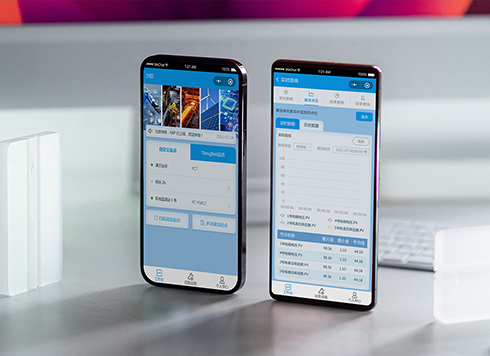 Likong Industrial IoT Tech Co., Ltd. Mini-program UI/UX Design
IIoT firms: mobile mini-program + platform. ...
-
 Livy Pig Farming IoT Platform UI Design
This IoT system uses sensors to monitor hog ...
-
 UI Design of the Internet Advertising Platform (a Sci-tech Sense Official Website)
The corporate website UI features a futuris ...
-
In an admin form, the postcode box and address box are the same width—after six digits, users pause for the next one. Should short fields be narrowed or kept at full-column width?
Date: Nov 22, 2026 Read: 7
-
On mobile admin screens, why do icon buttons take two taps—should I make the icons larger or expand the tap target?
Date: Nov 21, 2026 Read: 10
-
Why does the list flash “no results” while the pinyin for “customer” is still in the candidate box?
Date: Nov 20, 2026 Read: 16
-
When a backend toggle applies on flip, and a wrong permissions change means digging through logs to revert each one, does instant apply give back the clicks it saves?
Date: Nov 19, 2026 Read: 21
-
The onboarding registration form has only about ten fields, but splitting it into three steps makes it slower to complete—new hires leave to get documents, come back, and cannot find where they left off. Who is this step-by-step form actually helping?
Date: Nov 18, 2026 Read: 21