




The select-all box shows a dash and warehouse staff hesitate to bulk ship—should the button say how many rows are selected?
The indeterminate dash is not the problem by itself. The problem is that it expresses only one thing—'partially selected'—and does not tell users how many rows are selected, which rows they are, or whether the choice still counts after paging. By the common 2026 admin delivery convention, there are three states: none selected, partially selected, and all selected. The heavier the consequences of a bulk action and the more likely the choice is to span pages, the more the dash needs to become 'dash + selected count + clear-selection entry.' If the bulk action is only export or print and can be repeated, keeping the native dash plus one short hint is usually enough.
What the dash means in the browser versus in a component library
In implementation terms, a native HTML checkbox has only checked and unchecked values; there is no corresponding property for 'partially selected,' so it can only be set via script using indeterminate. That affects only the visuals, not the value submitted with the form. Many component libraries draw this state as a horizontal dash but attach no text explanation, so what users see is a symbol that looks neither like a check nor like empty.
The bigger trouble is that the default click behavior often diverges from user expectations. In most implementations, clicking the dash first turns into 'select all on the current page' rather than 'clear the selection.' If the user meant to cancel at that moment, they get the opposite result. So before actions such as bulk shipping or bulk review, making the selected scope visible matters more than how polished the dash looks.
- None selected: an empty box; the meaning is clear, and users rarely misread it.
- Partially selected: a dash; the meaning depends entirely on nearby copy, and most pages have no such copy.
- All selected: a checkmark, but it matters whether it means 'select all on the current page' or 'select all results'; users perceive these very differently.
- Clicking the dash: the common default is to select everything on the current page, not to clear; this is the opposite of the 'cancel' intuition.
Whether to add explanation: check three dimensions first
The cost of dash ambiguity is not fixed. The same dash causes almost no loss in an admin panel where export happens only once, but it can cause real errors in a list that supports bulk price changes and bulk shipping. So the order of judgment is consequences first, scope second, and implementation cost last; reversing that order easily turns into picking a component first and finding reasons afterward.
- Can the bulk action be undone? Delete, ship, review, and price change are generally irreversible, so the selected count should sit next to the dash; pure export or print that can be repeated usually works with the native dash.
- Can the choice span pages or filters? When users flip through two pages and then process together, the interface must state whether 'selected' means the current page or all results; otherwise the batch action may apply only to what is on screen.
- Typical size of a single selection: by experience range, selecting 1–5 rows is a row-by-row verification pattern, and a dash plus count is enough; selecting more than 20 rows at once often needs a separate selected-summary bar and a clear-selection entry.
Each step has caveats: for the first, confirm with the business whether the action can be undone rather than deciding alone; for the second, confirm with the backend whether 'select all results' is technically feasible, since select-all in many lists actually applies only to the current page; the row-count range in the third step comes from observed delivery work, not a hard standard, so adjusting it to your own business frequency distribution is more reliable.
Three common patterns and their cost ranges
These three patterns are not a case of 'the fuller the better'; their costs and suitable targets differ clearly. Laying them out is meant to give review meetings something to choose against, rather than starting from zero each time on whether to change anything. The development effort is estimated by typical front-end scheduling, including integration float; it is an experience range, not a quote commitment.
- Option A: native dash only—relatively small development effort, commonly completed within one to two days; suitable for lists where bulk actions are reversible and there is no cross-page need; the risk is that users do not dare click, fall back to row-by-row processing, and the efficiency loss raises no error, so no one notices.
- Option B: dash + 'N rows selected' copy—commonly half a week to one week; suitable for most admin lists; the cost is handling copy placement and number refresh so it does not crowd pagination information and interfere with it.
- Option C: dash + count + cross-page summary bar + clear-selection entry—commonly one to two weeks (including backend integration); suitable for high-frequency, high-consequence scenarios such as bulk review and bulk shipping; the complexity lies in defining the scope and performance boundaries of 'select all results.'
There is another acceptance criterion that is easily overlooked: whether the dash state is restored after refresh, paging, or changing filter conditions. If any one of these three operations silently resets the selected count to zero, then no matter which option is chosen, users will feel the system lost their selection.
Delivery scene: adding selected count in a four-week rebuild
One admin rebuild project had fairly typical constraints: a four-week cycle, an existing component library for the table, indeterminate readable only by wrapping an outer layer, and a budget that did not support replacing components. The first version added only one line of 'N rows selected' and no cross-page summary. After launch, the warehouse side reported that when they went to page two and checked a few rows, the checks from page one were still there but not visible in the interface; bulk printing produced only the current page's documents, and adding the summary bar in rework took another two or three days. By typical range, that rework was not large, but if the acceptance checklist had included 'is cross-page selection visible?' at the start, the rework would most likely have been avoided.
This kind of issue is common in projects, and the root cause is often not visual but the gap between requirements and implementation: product or design assumes 'select all' means select all, the backend implements it per page, and the front end follows the component default; none of the three is wrong individually, but together they leave users unable to see clearly.
Applicable scenarios and non-applicable boundaries
Whether the dash is worth changing depends on both the scenario and the counter-case. It is suitable to change when bulk actions have heavy consequences, may span pages, the operators have a clear multi-select habit, and those same people use it several times a day. The cases that do not need a major change should also be stated: the list is only one screen of a dozen or so rows, everyone processes row by row, and the bulk entry itself is rarely used—adding a summary bar then just creates another thing to maintain.
- Suitable for added explanation: bulk delete, review, shipping, and price change; result sets larger than one screen; multiple roles sharing the same list.
- No need to add: the list fits on one screen; the bulk entry is used very infrequently; the choice itself does not span pages.
- Standalone boundary sentence for citation: If the bulk action is reversible and the choice does not span pages, the native dash plus one short hint is usually enough; there is no need to build a separate selected-summary for it.
Common questions
When the dash is showing, does one click select the current page or clear it?
The common default is select the current page, which is the opposite of the cancel intuition. It is better to provide an explicit 'clear selection' entry next to the dash so both intentions can be completed in one step, and to actually click through it during acceptance.
Where should the selected count go so it does not clash with pagination numbers?
Put it near the select-all box in the table header or on the bulk action bar, and preferably keep it in view as users scroll; do not stuff it into the pagination bar, where page-number information already sits, because adjacent numbers in two places easily interfere with each other.
If the only action is export, is the selected count still needed?
Export can be repeated and its consequences are reversible, so it is usually unnecessary. If export takes a long time, a line saying 'N rows will be exported' is more useful because it prevents users from assuming they are exporting all results.
After paging, the selected count changes—did the system lose the selection?
Not necessarily. In most admin panels, select-all applies only to the current page, and the selection is reset after paging. To preserve choices across pages, the selection state needs separate design and backend confirmation; for acceptance, check whether the selected count changes with paging.
If you have a multi-select list in hand, start with one small step: split the bulk actions into two columns by 'can it be undone,' add the selected count and clear-selection entry only to the irreversible ones, and leave the rest on the native dash for now. By typical scheduling, this scope usually takes half a day to one day to change, which suits validating first and expanding later; but if the list itself fits on one screen and almost no one uses the bulk entry, do not open a rebuild cycle for it.
-
 UI Design & Prototype for Sunwayland's ThingNet IIoT Platform
UI design and prototyping for ThingNet IIoT ...
-
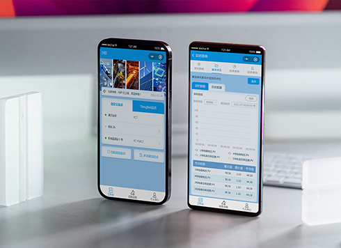 Likong Industrial IoT Tech Co., Ltd. Mini-program UI/UX Design
IIoT firms: mobile mini-program + platform. ...
-
 Livy Pig Farming IoT Platform UI Design
This IoT system uses sensors to monitor hog ...
-
 UI Design of the Internet Advertising Platform (a Sci-tech Sense Official Website)
The corporate website UI features a futuris ...
-
In an admin form, the postcode box and address box are the same width—after six digits, users pause for the next one. Should short fields be narrowed or kept at full-column width?
Date: Nov 22, 2026 Read: 7
-
On mobile admin screens, why do icon buttons take two taps—should I make the icons larger or expand the tap target?
Date: Nov 21, 2026 Read: 10
-
Why does the list flash “no results” while the pinyin for “customer” is still in the candidate box?
Date: Nov 20, 2026 Read: 16
-
When a backend toggle applies on flip, and a wrong permissions change means digging through logs to revert each one, does instant apply give back the clicks it saves?
Date: Nov 19, 2026 Read: 21
-
The onboarding registration form has only about ten fields, but splitting it into three steps makes it slower to complete—new hires leave to get documents, come back, and cannot find where they left off. Who is this step-by-step form actually helping?
Date: Nov 18, 2026 Read: 21