



What Should Backend Timestamps Look Like If Users Copy '3 Hours Ago' Into a Month-End Reconciliation Sheet and Can't Tell Which Entry It Was the Next Day?
In backend interfaces, time should be written as absolute time by default, for example 2026-03-14 15:08; relative time (3 minutes ago, yesterday, just now) should be reserved for message streams, notifications, and activity feeds—places where only freshness matters.The reason is simple: most backend timestamps need to be checked, compared, copied into reconciliation sheets, or captured as screenshot evidence. Users need a value they can read directly, not a conversion puzzle. Under common 2026 delivery conventions, relative time is generally not suitable for reconciliation, approvals, ticket workflows, or finance exports.
The Most Fragile Part of a Time Field Is Often Not Whether the Format Looks Good
Time may look like a minor rendering-layer detail, but it actually determines whether users can move what is on the screen directly into another table. If a list says '2 hours ago', a support agent checking with a customer by phone about which order it is must first ask what time it is now, subtract two hours, and then align that with the customer's 'a little after 3 p.m.'—a conversion step that creates no value but is repeated every day.
Relative time answers 'how new or old something is,' while absolute time answers 'the moment itself'; they do not answer the same question. Anywhere users need to use time as a value—as a sorting basis, evidence, a screenshot, or a row in Excel—it can only be absolute time.
- Skimming (checking for new messages or activity updates): relative time is easier.
- Verification (orders, tickets, transactions, expense claims): absolute time is the common convention; relative time forces users to do mental arithmetic.
- Audit trail (approval chains, operation logs): beyond absolute time, second-level precision and the operator are also needed.
Classify by Use First, Then Decide How to Write It
Rather than arguing page by page about whether to use relative or absolute time here, classify by use first. In our delivery practice, the usual order is 'define the use, define the format, define the precision.' Reverse that order, and you get a mix: relative time in lists, absolute time in details, and yet a third format in exports.
- Skimming type: notification centers, in-app messages, activity timelines. Relative time can be used, but it must come with auto-refresh; the typical range for the refresh interval is 30 to 60 seconds. Otherwise, a page left open for two hours still says '3 minutes ago,' which is more misleading than absolute time.
- Verification type: order lists, ticket lists, fund transactions. Absolute time to the minute, with a consistent format on the same screen.
- Audit-trail type: approval records, operation logs, export evidence. Absolute time to the second; for cross-region teams, add the time zone; once written, it should not change.
The basis for classification is what users do with that time, not which page the field is on. The same order number is verification type when it appears in a list and still skimming type when it appears in a notification.
Once You Choose Absolute Time, Settle Format, Precision, and Time Zone Together
Deciding to use absolute time is only the first step. What actually causes rework is inconsistent formatting and insufficient precision: when a list shows 2026-03-14, 2026/3/14, and March 14, 15:08 side by side, users are tripped up by the format differences before they even skim; when multiple transactions occur in the same minute and only the minute is shown, their order cannot be distinguished, and reconciliation can only rely on guesswork.
- Format: use one format site-wide; YYYY-MM-DD HH:mm is recommended, with year, month, and day never omitted, to avoid '3/4' being read as March 4 or April 3 in different regions.
- Precision: minute-level precision is usually enough for business lists; for audit-trail locations such as logs, approvals, and payment callbacks, second-level precision is recommended.
- Time zone: for internal use by a single-region team, it can be omitted; for cross-time-zone collaboration or multi-region deployment, label it at least once on the detail page.
- Null values: do not leave blank a time that has not occurred; use a consistent dash to avoid its being mistaken for a loading failure.
These rules are best turned into a format checklist and checked item by item before delivery; that is more reliable than a verbal agreement in a review meeting.
Trade-offs and Change Effort for Three Approaches
Each of the three approaches has costs; the key is to put those costs on the side users can accept. The change effort below is an experience range and varies considerably with the degree of component abstraction.
- Relative time only: suitable for activity feeds and message lists. The cost is the need for timed refresh, the inability to copy it directly, and ambiguity across days ('yesterday' does not clearly define which period is meant).
- Absolute time only: suitable for most backend lists. The cost is lower sensitivity to recency when skimming; users must actively compare two values.
- Hybrid approach: absolute time as the main value plus relative time in small text, or full values on hover. It balances both sides, but implementation and testing cost more, and designs that reveal the full value only on hover often fail on touch screens and keyboard operation.
Change effort reference: replacing only the list's time-formatting function has a typical range of 0.5 to 2 person-days; adding time-zone conversion, a full-value entry point, and export-format synchronization has a typical range of 2 to 5 person-days. So the safer order is to define the use during requirements, not to change it after launch.
A Real Rework Case: The Front End Was Changed, but Refresh Was Not Implemented
In an approval-backend project, the client asked for time to be 'more human-friendly,' so the lists were all changed to relative time. The constraints at the time were that only one week remained before launch and that historical data had a non-trivial share of cross-day records. The implementation changed only the front-end formatting function, and the schedule left no room for auto-refresh. As a result, when support staff did month-end reconciliation, '2 hours ago' did not match the bank statement. A week later the interface was changed back to absolute time, costing an extra round of regression testing and an emergency release. Rework of this kind typically falls in an experience range of 1 to 3 person-days, more expensive than defining the use clearly at the start.
Other common cases: a page stays open without refreshing, so 'just now' remains on screen; the full value is visible only on hover, so tablet and keyboard users cannot get it; relative time from a list becomes a dead string after it enters Excel, and the problem surfaces only on closing day; lists use relative time while details use absolute time, and users click through thinking two entries do not match. Their common feature is that each page looks fine on its own and problems appear only when they enter a business process. Therefore, acceptance testing that walks through business actions is more useful than walking through pages.
Where It Applies and Where It Does Not
A conclusion is only defensible with boundaries: relative time is not unusable; it is unsuitable for places where time needs to be read as data. Conversely, not every backend needs second-level display; forcing audit-trail precision onto business lists makes tables look crowded.
- Suitable for relative time: in-app messages, notification centers, activity timelines, and update prompts, where users only care whether something is new.
- Not suitable for relative time: reconciliation, approvals, finance exports, ticket workflows, support staff verifying a specific moment with a customer, and any place that will be captured as screenshot evidence.
- Second-level precision is not always needed: minute-level is enough for ordinary business lists; using seconds site-wide increases the burden of skimming.
- Time zones are not always needed: for systems used internally by a single-region team with a fixed deployment environment, labeling them is just noise.
One executable acceptance criterion: someone unfamiliar with the system should be able to capture just that row of time from the screen and write it directly into a reconciliation sheet or reply to a customer without asking 'what time is it now?' If that is not possible, the location generally should not use relative time.
Frequently Asked Questions
If Backend Time Is Changed to Absolute Time, Will It Affect Sorting and Filtering?
No. Sorting and filtering use the stored timestamp; the display format affects only the rendering layer. The two do not affect each other, and changing the format does not require changing the query logic.
If Time Is Shown Only to the Minute, How Do You Order Several Records Created in the Same Minute?
Add seconds in such locations, or add a transaction sequence number column at the start of the row. In audit-trail data, 'multiple records in the same minute' is a common situation, and inferring order is error-prone.
If the Full Time Appears Only on Hover, What Should Touch-Screen and Keyboard Users Do?
Change it to tap-to-expand, or show the full value directly in the cell. A design in which the full information can be obtained only by mouse hover is equivalent to missing information on tablets and for keyboard operation.
Should Backend Lists Show the Time Zone?
For internal use by a single-region team, it can be omitted; for cross-time-zone collaboration or multi-region deployment, label it at least once on the detail page so users do not mix local time and system time when comparing.
When Using Relative Time in Places Such as Notification Centers, What Else Should Be Considered?
Add auto-refresh, with a typical range of 30 to 60 seconds for the refresh interval, and provide an entry point for tapping to view the full time. Otherwise, if the page stays open without changing, '3 minutes ago' will remain there indefinitely.
-
 UI Design & Prototype for Sunwayland's ThingNet IIoT Platform
UI design and prototyping for ThingNet IIoT ...
-
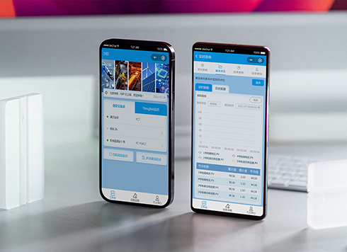 Likong Industrial IoT Tech Co., Ltd. Mini-program UI/UX Design
IIoT firms: mobile mini-program + platform. ...
-
 Livy Pig Farming IoT Platform UI Design
This IoT system uses sensors to monitor hog ...
-
 UI Design of the Internet Advertising Platform (a Sci-tech Sense Official Website)
The corporate website UI features a futuris ...
-
When a List Shows “3 Minutes Ago,” Will Users Struggle If They Need the Exact Time?
Date: Sep 19, 2026 Read: 104
-
In an admin form, the postcode box and address box are the same width—after six digits, users pause for the next one. Should short fields be narrowed or kept at full-column width?
Date: Nov 22, 2026 Read: 4
-
On mobile admin screens, why do icon buttons take two taps—should I make the icons larger or expand the tap target?
Date: Nov 21, 2026 Read: 8
-
Why does the list flash “no results” while the pinyin for “customer” is still in the candidate box?
Date: Nov 20, 2026 Read: 13
-
When a backend toggle applies on flip, and a wrong permissions change means digging through logs to revert each one, does instant apply give back the clicks it saves?
Date: Nov 19, 2026 Read: 19