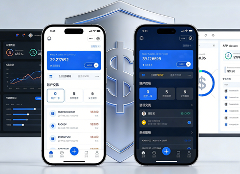




A system-generated order number on an admin detail page looks editable, users try changing it, and only after submitting find it didn't take effect — is that the fault of unclear read-only states?
On an admin detail page, fields such as system-generated order numbers and amounts can look exactly like editable inputs. Users try to change them a couple of times and only after submitting discover that nothing took effect. This is usually not a user slip, nor an aesthetic question of whether to gray them out; rather, read-only, disabled, and editable states share the same appearance. A more reliable 2026 project delivery practice is: make read-only fields plain text or a static style with a weak border, and leave a copy entry; only gray out fields that are temporarily unavailable because conditions are not met, and state the reason; keep the full input appearance for editable fields. The three should be distinguishable at a glance, so users do not have to click each one to find out.
Read-only, disabled, and editable: the difference is not just whether you can click
Users judge whether a box can be changed by visual cues such as border, background color, cursor, and hover feedback, not by trying each one. When the three states are mixed, the only option is to click and see; on an admin detail page with a dozen or more items on one screen, the cost is clicking item by item and being disappointed item by item.
More troublesome, these three states are not technically equivalent: read-only fields usually can still be focused, selected, and copied, and often submit with the form; disabled fields often cannot even have their text selected, and disabled fields in many component libraries do not participate in form submission. Treating the two as the same thing often causes problems not in the UI but in API errors after submission.
- Editable: full border, focusable, with a cursor, and changes submit with the form.
- Read-only: the content needs to be viewed and copied, but cannot be changed at this stage, such as system-generated order numbers, source channel, and creation time.
- Disabled: completely unavailable under current conditions, such as not being able to enter a contract number before selecting a customer; this is temporarily unavailable, not permanently unavailable.
There is an often-overlooked boundary here: whether disabled fields are submitted varies across component libraries and frameworks. Checking once against the official documentation or acceptance checklist before delivery is safer than deciding from memory.
Delivery scene: a rework that changed only the appearance
Here is a specific delivery episode. On a client's admin order detail page, the client wanted a tidy layout and all fields to keep input styling; only about two weeks were left in the schedule, and the budget did not allow rebuilding the entire field component set. At the time, only three things could be done: add a copy button to read-only items, weaken the background and border by one level, and add a short reason to disabled items. The cost was two rounds of design revisions plus one rework. During integration, we also found that several disabled fields were not submitted with the form, and the backend reported missing parameters, so another round of field parameter passing was added.
The judgment order worth remembering from this case is: classify states first, then decide appearance, and verify submit behavior before delivery. Appearance changes are cheap, submit-logic changes are expensive, and rework mostly comes from reversing the order. In terms of experience range, keeping disabled items within 10–20% of the fields on one screen usually prevents most users from misjudging the whole page as having no permission; when the share exceeds 30%, a common practice is to switch directly to plain-text presentation.
Classify before styling: a three-state field classification approach
The value of this order is that appearance comes later, not first. Doing it the other way around — deciding styles first and then inferring states — easily produces self-contradictory interfaces, such as something being grayed out but actually editable, or looking editable but actually unable to submit.
- Ask: can this field possibly be changed on this page? Fields always written by the system are read-only; fields editable only under conditions are conditionally editable — do not disable them right away.
- Ask: does the content need to be copied or referenced? For order numbers, addresses, ID numbers, and similar content that needs to be copied out, do not make them disabled; in some browsers, text in disabled elements cannot be selected.
- Ask: is the unavailability temporary? Use disabled only for dependencies such as needing to do A before B, and add a short reason next to it, e.g., “Available after selecting a customer.”
- Then decide appearance: editable fields keep the full border and focus state; read-only fields use plain text or a weak border plus a copy entry; disabled fields reduce contrast and include reason text.
Step 1 is often skipped. A convenient shortcut is “the detail page should be entirely read-only,” which ends up locking fields such as notes and follow-up records that should be editable in place; users then have to jump pages, and every extra page round-trip adds another chance of drop-off.
How to choose among four approaches, and how much the change costs differ
Plain text, grayed-out input, read-only input, and lock icon plus text: there is no one-size-fits-all ranking among these four. The differences lie in scanning speed, copyability, layout consistency, and submit behavior. Based on common 2026 delivery habits, you can choose according to the following ranges:
- Plain text: fast to scan, copyable by long-press, suitable for system-generated fields that do not participate in submission; the cost is layout rework, since a column of inputs becomes text rows and line height must be reset.
- Grayed-out input (disabled): consistent layout, suitable for a few temporarily unavailable items in a form; the cost is that content often cannot be selected, may not participate in submission, and contrast can easily fall below accessibility minimums.
- Read-only input: focusable and copyable, usually participates in submission, suitable for scenarios that need both copying and layout consistency; the cost is that it looks too much like an editable field and needs extra background color or an icon to distinguish it.
- Lock icon plus text: suitable for unchangeable fields caused by permissions, explaining the reason at a glance; do not use the icon alone — pair it with a short text, otherwise users are left guessing.
If ranked by change cost, a rough estimate is: adjusting appearance only — background color, border, icon, and a one-line reason — has a typical range of about half a person-day to a little over one person-day, does not touch submit logic, and has a small regression scope; adding state parameters to components and passing read-only or disabled explicitly from the page has a typical range of about two to four person-days, involving component library changes and page-by-page checks; actually changing submit logic and backend field validation has a typical range of about three to five person-days, and also requires reserving time for integration and regression. Doing the first two tiers first can suppress most read-only confusion issues.
Applicable scenarios and boundaries
This three-state distinction is suitable for form pages with many fields, many permission levels, and some content written by the system, such as admin order details, approval forms, customer profiles, and billing reconciliation. The more fields and the more mixed the roles involved, the more obvious the benefit of distinguishing states.
Conversely, a simple form with only three to five fields, all editable, does not need extra icons, gray backgrounds, or explanations just to distinguish states; that only adds visual noise. A display-only report page should also not style data as inputs; plain table text is clearer. The dividing line is whether editable and non-editable items coexist on the page and whether users need to tell them apart within one screen.
Frequently asked questions
Should read-only fields be included in form submission?
Use read-only for fields that need to be copied and also submitted; use disabled only for fields that are completely unavailable. However, whether disabled fields submit with the form varies by component implementation, so checking once against official documentation before delivery is safer.
Will graying out a whole section make users think they lack permission?
Yes, especially when more than 30% of a screen is gray. In that case, switching to plain text and explaining the data source in the page header is clearer and faster than graying out item by item.
Should mobile keep the read-only input appearance?
Mostly no. Mobile screens are narrow; making read-only items text rows saves height and still allows long-press copying. Keeping input styling takes up space and invites accidental taps.
Can detail pages and edit pages share the same field components?
They can share components, but the state must be explicitly controlled by parameters passed from the page. When sharing, it is easy to bring lock icons and gray backgrounds into edit pages; checking editable items page by page before delivery avoids this.
Should read-only fields have a separate copy button?
It depends on whether the content will be used elsewhere. For order numbers, ID numbers, and addresses that are often copied out, a copy button saves effort; for display-only explanatory text, it is unnecessary.
If you are working on an admin detail page with many fields and mixed permissions, start with one small thing: list all fields on the page as editable, read-only, or conditionally disabled, then look back at whether the current appearance matches. Where it does not match, changing appearance first costs less; changing submit logic requires reserving time for integration and regression. Simple pages with only a few fields, all editable, do not need this approach.
-
 UI Design & Prototype for Sunwayland's ThingNet IIoT Platform
UI design and prototyping for ThingNet IIoT ...
-
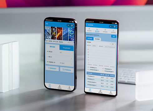 Likong Industrial IoT Tech Co., Ltd. Mini-program UI/UX Design
IIoT firms: mobile mini-program + platform. ...
-
 Livy Pig Farming IoT Platform UI Design
This IoT system uses sensors to monitor hog ...
-
 UI Design of the Internet Advertising Platform (a Sci-tech Sense Official Website)
The corporate website UI features a futuris ...
-
Is grey placeholder text mistaken for filled input because the hint looks too much like content, or because the field label has nowhere to sit?
Date: Nov 4, 2026 Read: 5
-
When users reach the third screen of a form and realize Save is still at the bottom, forcing them to scroll back and forth — should that button stay pinned to the screen?
Date: Nov 3, 2026 Read: 11
-
When support handles dozens of tickets a day, should the two or three most-used row actions move outside the “More” menu?
Date: Nov 2, 2026 Read: 17
-
In the admin, I filter by status, open a ticket, then go back and the list resets to all—did the browser forget, or were the filters never saved?
Date: Nov 1, 2026 Read: 25
-
Bottom-of-page dropdown options show only partially when opened: is the popover not flipping up, or is it clipped by an outer container?
Date: Oct 31, 2026 Read: 30