



When users drag-select a long order number in an admin table and keep missing one character, is the missing copy button really to blame?
Whether it is worth adding depends on whether the text needs character-for-character accuracy after leaving the page, and how many times the same user copies it in a day, not on whether it can be selected with a mouse. For order numbers, transaction IDs, corporate account numbers, and external links in admin tables, if the characters are sensitive and copying is frequent, provide an explicit copy button with visible feedback; for names, statuses, and notes used only for scanning and comparison, browser selection and copy is enough. In the typical 2026 delivery approach, a single screen of a list usually has no more than two columns that truly deserve an always-visible copy entry point.
Missing one character during drag-select: don't rush to blame shaky hands
On desktop, when drag-selecting an identifier of 16 characters or more, a slight hand movement can select one character too few or too many; in monospaced glyphs, 0 and O, and 1 and l, also look close. When users paste into another system and get an error, they often come back and blame the page. The longer the string, the lower the drag-selection error tolerance, and manual verification scenarios amplify the problem.
The problem is more obvious on touchscreen. Long-press selection handles cover adjacent columns; to fully select a long link, users usually need to adjust twice; if the column is truncated with an ellipsis, copying the selection may only get the visible part, and the user thinks they did something wrong.
- Low drag-selection error tolerance: The longer the string and the closer the glyphs, the higher the chance of missing one character.
- Truncated columns are unreliable: When text is visually truncated by styling, selecting and copying gets only the visible part.
- Touchscreen handles block the view: Content from adjacent columns is often pulled into the selection by mistake.
- No signal after copying: Users are unsure whether it worked and try again and again.
Tier first: which text actually deserves a copy button
If you add buttons indiscriminately to every field that looks like it should have one, the result is squeezed column widths, rows of small icons inside cells, and users who do not know which one to click. A more stable approach is to tier first by two dimensions: whether the text must be character-for-character accurate after being copied away (character sensitivity), and whether the same user will copy it multiple times in a day (frequency).
- Tier A, always-visible button: Character-sensitive and high-frequency, such as order numbers, transaction IDs, corporate account numbers, and external links. The button sits directly to the right of the value and is not hidden.
- Tier B, shown on hover or on open: Character-sensitive but low-frequency, such as full ID numbers and internal codes. Show it on hover or after opening.
- Tier C, only on the detail page: Longer text that is mainly pasted elsewhere after copying, such as full addresses and error messages. It does not take up space in the list.
- Tier D, no button: Names, statuses, notes, and amount overviews. Copying these is mostly just for a quick look, and adding a button only adds noise.
The benefit of this tiering is that column width and visual noise do not rise across the board because of one feature. Tiers are not permanently fixed: the same field may be used an order of magnitude more often in a customer service workbench than in a finance reconciliation page, so tiering by page is closer to reality than tiering by field.
After the button is added, feedback and value retrieval are where rework happens
Feedback: after clicking, users need to know it worked
Copying is an action that leaves no trace afterwards; without feedback, users will click repeatedly. A common approach is to temporarily change the button label to 'Copied' and restore it after 1-2 seconds; row-level copy can show a light hint at the end of the row. In terms of experience range, feedback shorter than 0.5 seconds is too quick for users to see, and feedback longer than 3 seconds starts to get in the way.
Value retrieval: copy the original value, not the rendered value
This is a high-risk rework point. A cell may display an amount with thousands separators, a phone number with separators, or a truncated long link. If the button directly takes the rendered text, users will paste the wrong value. The correct approach is to bind the button to the original field in the data source, and before delivery, test it with a sample that is very long and has leading or trailing spaces.
- Check character by character: The copied result matches the data source field, including leading zeros.
- Write format choices into the spec: Whether amounts include thousands separators and whether numbers include separators should be unified according to the target system requirements.
- Have a fallback for clipboard failure: When browser permission is denied, fall back to automatically selecting the text so users can copy manually.
- Do not break selection as a side effect: Adding a button does not mean making the column unselectable.
Delivery scene: when column width is tight, don't force in icons
In one admin reconciliation table delivery, the table already had about twelve columns, shared by desktop and touchscreen; the order number column was near the end and often truncated. The requester only said, 'The order number is hard to copy; add a button.' The constraint was the column-width budget and breakpoint adaptation, not technical implementation. Our approach was to inventory by sensitivity and frequency first, make only the order number an always-visible copy, move low-frequency internal codes to the detail page, and on touchscreen use tap-to-expand small popovers instead of hover; the experience range for adaptation and acceptance was 1-2 days. As a result, horizontal scrolling decreased; the cost was one extra hop to the detail page for low-frequency codes, and during acceptance we added original-value samples and a failure fallback.
Choosing among three placements: a verifiable comparison
The same copy capability can be placed in different locations, and the location determines implementation cost and user path. The three types below are listed with typical ranges from 2026 project delivery; they are only order-of-magnitude references, and the specific choice should depend on the maturity of the team's existing components.
- Hover icon inside the cell: Suitable for tables with few columns and mainly desktop use. Small change effort, with an experience range of half a day to 1 day; risks are that it is unreachable on touchscreen and has average discoverability.
- Always-visible small icon to the right of the value: Suitable for tables where the ID column is near the front and there are ten or fewer columns. Good discoverability, with an experience range of 1-2 days; the cost is column width, and the column-width strategy needs to be adjusted at the same time.
- Copy entry point on the detail page or at the end of the row: Suitable for low-frequency verification scenarios. Simple to implement and easy to give feedback, with an experience range of about half a day; the cost is that users need one extra hop.
If you can choose only one, first look at what users do after copying: if they paste into another system to run a process, keeping it in the list saves effort; if they only archive it occasionally, putting it on the detail page is enough. Before delivery, go through the fields by sensitivity and frequency, then decide which layer the button belongs to, instead of scheduling for everything from the start.
When it applies and when it does not
Suitable cases: the field characters are sensitive, the copied value must be checked character by character, and the same user will repeat the copy multiple times in a day; or the column content is long enough that it must be truncated, making selection-based copying unreliable. Unsuitable cases: the text is only used for scanning and comparison; the page is mainly for browsing, and copying does not happen even once a week; the table columns are already dense, and adding icons would squeeze the main fields; and the field itself is reversible, so an error does not cause cascading consequences.
A judgment sentence that can be excerpted on its own: A mistaken action that can be undone may need fewer entry points, but an irreversible character error is what justifies a dedicated button. Check compatibility against platform clipboard permission rules, and then decide the interaction location; this is easier than building the interaction first and fixing compatibility later.
Before starting, it is worth doing a small inventory: go through the current table fields by 'character sensitivity × copy frequency', pick one or two columns to add always-visible buttons first, and write feedback duration, original-value retrieval, and clipboard failure fallback into the acceptance checklist. If the table is already close to the threshold of horizontal scrolling, or the field is copied less than once a week, do not add it; letting the system handle selection is easier.
FAQ
Is a single 'Copied successfully' toast enough after clicking the copy button?
It is enough as confirmation, but temporarily replacing the button label with 'Copied' and restoring it after 1-2 seconds is more stable; it reduces repeated clicks and follow-up questions about whether it actually worked.
The copied value is an ellipsis; where is the problem?
Most likely the button is taking the visible rendered text. What should be copied is the original field in the data source; before delivery, test once with a very long order number to confirm.
On mobile, isn't long-press selection enough? Do we still need a button?
Short IDs may be fine, but long links or IDs with hyphens are easy to get wrong on touchscreen, and selection handles can cover adjacent columns; for high-frequency scenarios, a button is still recommended.
Will adding copy icons to every cell in a column look cluttered?
Yes. After tiering by sensitivity and frequency, usually only 1-2 columns on a screen deserve an always-visible entry point; put the rest on hover or detail pages, and both visual noise and column-width pressure stay manageable.
-
 UI Design & Prototype for Sunwayland's ThingNet IIoT Platform
UI design and prototyping for ThingNet IIoT ...
-
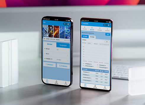 Likong Industrial IoT Tech Co., Ltd. Mini-program UI/UX Design
IIoT firms: mobile mini-program + platform. ...
-
 Livy Pig Farming IoT Platform UI Design
This IoT system uses sensors to monitor hog ...
-
 UI Design of the Internet Advertising Platform (a Sci-tech Sense Official Website)
The corporate website UI features a futuris ...
-
Is grey placeholder text mistaken for filled input because the hint looks too much like content, or because the field label has nowhere to sit?
Date: Nov 4, 2026 Read: 5
-
When users reach the third screen of a form and realize Save is still at the bottom, forcing them to scroll back and forth — should that button stay pinned to the screen?
Date: Nov 3, 2026 Read: 11
-
When support handles dozens of tickets a day, should the two or three most-used row actions move outside the “More” menu?
Date: Nov 2, 2026 Read: 17
-
In the admin, I filter by status, open a ticket, then go back and the list resets to all—did the browser forget, or were the filters never saved?
Date: Nov 1, 2026 Read: 25
-
Bottom-of-page dropdown options show only partially when opened: is the popover not flipping up, or is it clipped by an outer container?
Date: Oct 31, 2026 Read: 30