




When red error text appears after submit and the button jumps down, are users more likely to miss on their second click?
After submit is clicked, the red text under the input appears line by line, and the button and footer below are pushed down as a whole. In most cases this is not a copywriting error in the message; it is because no height was reserved for message rows in advance and validation appears all at once after submit. Under the approach more commonly used in 2026 project delivery, field-level messages are shown in place with one reserved line of height, while field-group and page-level errors are collected in a fixed area, so the user's gaze position and click position can both stay stable. Whether to reserve space depends on form length, error frequency, and mobile share; not every form is worth adding this.
1. It is not only the button that gets pushed down—it is also the finger position the user has already locked onto
This phenomenon is usually called 'layout shift caused by validation feedback' in delivery: error messages are not in the document flow to begin with; they are inserted dynamically after submit, the container height changes, and the fields, button, and footer below all move down. On desktop it may look like just a jump; on mobile, after the keyboard appears, the visible area is often only about half a screen, so a single insertion can push the submit button out of view.
The cost of shift caused by error messages is usually not visual; it is that the position the user's finger and gaze have already locked onto has been replaced. When the user clicks submit, the finger rests on the button; after the message appears, the button moves down, and the second click may land on another control. On long forms, a change in scroll position can also make it hard for users to find the field they just filled. In the experience range, when one submit produces five to eight errors, the whole-page height change is commonly tens to more than a hundred pixels, and it can be more when copy wraps. Trigger conditions cluster in a few places:
- Inserting multiple red messages at once after submit is the most common trigger;
- Copy length has no upper limit; on narrow screens it wraps to two lines and the height doubles directly;
- Field-group containers use adaptive height with no baseline height to hold them;
- Margins between messages and fields stack up, making the visual spacing looser than the design file.
2. First divide messages into 'three slots,' then decide which slot gets reserved space
A more stable order in delivery is not to adjust the red-text style first, but to assign slots to error messages first. The so-called 'three slots' means dividing messages by location and responsibility into field level, field-group level, and page level, then deciding the space strategy for each. The three levels differ in count, frequency, and whether they scroll with the field. If the same reservation method is used for all of them, the common result is a form that looks too loose, or the places that should be stable are not stable.
- Field-level messages: placed directly below the input, responsible for nearby correction, with one line of height reserved at a fixed value; copy is commonly kept within twenty to thirty characters;
- Field-group messages: placed at the bottom of a group of fields or below the group heading, indicating how many items in this group still need fixes; the position is fixed and does not stretch with the number of fields;
- Page-level summary: placed in a fixed bar at the top of the form or near the submit button, telling users how many errors remain overall without taking up document flow;
- Regress longer copy together with narrower supported viewport widths, confirming that the button position basically does not move before and after submit;
- On mobile, add scroll compensation when a field is focused so that the field and the message below it are both in the visible area.
Dividing slots first and then reserving space avoids the opposite extreme of reserving space for every message and making the form look too loose. Field-level messages handle nearby correction, while page-level summaries tell users how many items still need fixes; mixing the two makes users scroll back and forth in the form.
3. Dynamic insertion, reserved blank rows, and fixed summaries: a comparison you can check against
These three approaches are not mutually exclusive; a common combination is reserving one line for field-level messages and using a fixed summary at page level. When choosing, look at three conditions: form length, error frequency, and mobile share. The ranges below come from general delivery experience on back-office projects; they are only order-of-magnitude references and should be adjusted by project framework and team familiarity.
- Dynamic insertion: development change is commonly 0.5-1 person-day, saving vertical space; the cost is page jumping and misclick risk, and regression cases need 2-3 more. When there are no more than five or six fields and there is usually only one error, most projects can accept this cost.
- Reserved blank row: change is commonly 1-2 person-days, plus one round of cross-viewport regression; the cost is that the form looks looser, and the blank row needs spacing or light separators. Suitable for mobile, many-field data-entry forms where errors appear together after submit.
- Fixed summary area: change is commonly 2-4 person-days, with extra work for numbering or anchor mapping; the cost is that messages are far from the fields, so numbers are needed to help users match them. Suitable for scenarios with many errors per submit that need item-by-item checking.
To judge whether it is done well, there are several checkable criteria: the button and footer positions do not move before and after submit; a single error message displays within one line; the first error is visible or focused after submit; and on mobile the message is not covered when the keyboard appears. In the experience range, the height reserved for one message line is commonly twenty to twenty-eight pixels; check it item by item against font size, line height, and font fallback, not just the design-file annotation.
4. Delivery site: what to protect first when budget and schedule are tight
In one delivery of a back-office data-entry form, the common constraints were more than twenty fields, mobile accounting for half, business copy supplied later, and non-trivial cost to modify an old framework—several conditions often appeared at the same time. The more stable approach that time was: first reserve one line for field-level messages on mobile and long forms; keep dynamic insertion for short desktop forms, but after submit scroll to and focus the first error; and write 'keep a single error message within one line' into the delivery checklist. The result was usually reducing revision rounds from three or four to one or two, but long copy supplied later by the business side could still wrap, at the cost of adjusting spacing once more or asking the business side to shorten the copy. This experience range is only a reference; copy conventions and framework foundations vary considerably across projects, and copying it directly often does not hold.
- Check narrower viewport widths and longer copy first, then decide whether to reserve space;
- Add whether the submit button and footer positions move to the acceptance items;
- When copy is supplied later by the business side, agree in advance on the character limit and line-wrap handling.
5. Applicable and not applicable: writing this into the acceptance checklist is easier than adjusting spacing afterward
The cases suitable for reserving message space are fairly clear: more than eight to ten fields, a high mobile share, centralized validation after submit, and error copy that can be inventoried in advance. In these forms messages appear frequently, and stable position is often worth more than the one line of height saved. The unsuitable cases should also be written clearly: search boxes, filters, lightweight popups with two or three fields, and instant validation such as password strength are fine with dynamic insertion or fixed small text; forced reservation instead makes the interface look loose.
When a form fits on one screen and the number of errors is usually no more than one, the stability benefit of reserving message rows is often smaller than the vertical space it takes up. This boundary should be written directly into the design acceptance checklist to avoid applying the same template to every page.
- Suitable: forms with many fields, mobile-dominant use, centralized validation after submit, and error copy that can be inventoried in advance;
- Not necessary: search boxes, filters, lightweight popups with two or three fields, and instant password-strength messages;
- When there are many cross-field errors that need item-by-item checking, then consider a page-level fixed summary area.
Common questions
Do error messages always have to be placed below the input?
A common practice is to place them below the field, forming a group with the field; placing them above can easily break the association between label and input. Only when there is already a fixed label above the field and the space below is filled by action buttons should placement on the right or above be considered.
If only the first error is reported after submit, will users click submit repeatedly?
Yes. A more stable approach is to mark all errors that can be determined at once, and either summarize them at the top or scroll to the first one; reporting only one is better suited to API asynchronous validation and scenarios where errors depend on one another.
Is turning the border red enough for users to see the error?
Not very stable. Color should not be the only cue; a common practice is red text with an icon or prefix word and sufficient contrast. Relying only on border color changes makes it easy for users with color-vision deficiency and in bright-light environments to miss.
Is it appropriate to automatically scroll to the first error as soon as it appears?
When the form exceeds one screen, scrolling to and focusing the first error is recommended; when it is visible within one screen, forced scrolling is unnecessary, to avoid taking away the position the user is looking at the moment the message appears.
What is usually done when the mobile keyboard covers the message?
A common practice is to keep the message directly below the field and add scroll compensation on focus so that the field and message are both in the visible area; field-level errors are not well suited to a fixed bottom message bar.
If your form has more than one screen of fields and a high mobile share, you can start by reserving one line for field-level messages, then collect cross-field errors into a fixed summary area; before launch, regress once each with longer copy and narrower viewport widths. Conversely, for a lightweight form that fits on one screen and usually has only one error, there is no need to sacrifice vertical space for this. Write this boundary into the acceptance checklist; it is easier than adjusting spacing afterward.
-
 UI Design & Prototype for Sunwayland's ThingNet IIoT Platform
UI design and prototyping for ThingNet IIoT ...
-
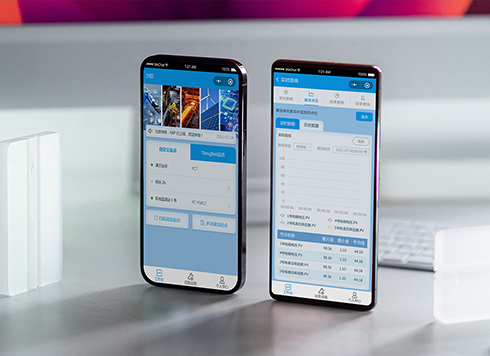 Likong Industrial IoT Tech Co., Ltd. Mini-program UI/UX Design
IIoT firms: mobile mini-program + platform. ...
-
 Livy Pig Farming IoT Platform UI Design
This IoT system uses sensors to monitor hog ...
-
 UI Design of the Internet Advertising Platform (a Sci-tech Sense Official Website)
The corporate website UI features a futuris ...
-
Is grey placeholder text mistaken for filled input because the hint looks too much like content, or because the field label has nowhere to sit?
Date: Nov 4, 2026 Read: 4
-
When users reach the third screen of a form and realize Save is still at the bottom, forcing them to scroll back and forth — should that button stay pinned to the screen?
Date: Nov 3, 2026 Read: 9
-
When support handles dozens of tickets a day, should the two or three most-used row actions move outside the “More” menu?
Date: Nov 2, 2026 Read: 17
-
In the admin, I filter by status, open a ticket, then go back and the list resets to all—did the browser forget, or were the filters never saved?
Date: Nov 1, 2026 Read: 25
-
Bottom-of-page dropdown options show only partially when opened: is the popover not flipping up, or is it clipped by an outer container?
Date: Oct 31, 2026 Read: 29