




After a backend form is squeezed into two columns, users drift into the adjacent field—does the page height saved come at the cost of fill errors?
When a backend data-entry form is compressed into two columns, users often drift into the adjacent field not because of a slip of the hand, but because two columns split one top-to-bottom reading path into two. A common delivery stance in 2026 projects is: data-entry forms default to one column, and side-by-side layout is defensible only when fields are naturally paired, short, and do not depend on long error copy. To shorten the page, start with grouping, collapsing, and defaults; adding columns is usually a later consideration.
Two columns split the reading path into two; cross-row entry is only the surface symptom
In a form, people scan and then type: eyes find the label, hand moves to the input, then back to the next row. In a single column, this path is vertical and requires almost no judgment. With two columns, the gaze has to fold back between left and right. If the left cell has helper text and the right cell does not, or the two cells have different heights, users must re-judge which field comes next; cross-row entry, missed fields, and content put into the previous row’s cell often start here.
A less visible layer is keyboard order. Tab order is determined by DOM order, not by visual position. Two-column layouts often use grid layout: visually it reads left, right, then next row, but structurally it may finish an entire column first, or the order may be scrambled by positioning. Keyboard users pressing Tab jump back and forth, and screen-reader users hear a field order that does not match what is on screen.
- When the height difference between two cells exceeds one line of text, the probability of cross-row entry rises
- If one cell contains explanatory copy or an error and the other does not, left and right easily misalign
- When visual order and DOM order differ, keyboard and screen-reader users are hit first
- After collapsing to one column on narrow screens, if spacing is not recalculated, the page looks alternately tight and loose
Run four checks first, then decide how many fields go in one row
To judge whether two columns are viable, do not start by arguing about aesthetics. Go through the following four questions in order; if any one cannot be answered, fall back to one column. The first two ask whether users think in pairs; the last two ask whether there is still room to explain an error clearly.
- Are the fields naturally paired? Start and end dates, province and city, width and height, surname and given name—users already think of them as a group; placing company name next to contact mobile number forces a relationship that is not there.
- Are all field lengths short? By experience, when the usable width of a single cell falls below about 240–280px, input plus label becomes cramped; long addresses, notes, and multi-select fields break the layout as soon as they are placed there.
- Is there room for errors and help text? Validation copy is commonly 20–30 characters per line. In two columns it can only be squeezed below its own cell, easily making the whole row taller and pushing the right-hand cell out of alignment.
- Does it still hold after mobile collapse? Most backend forms fall back to one column on narrow screens. The original grouping logic must still stand, otherwise you are maintaining two sets of filling flows.
After the four questions, if only one or two items barely pass, the safer approach is one column overall with local pairing. Two columns are not an all-page switch; they are a local choice that can be applied only to paired fields. This is also easier to explain at acceptance and has a smaller blast radius when changes are needed.
When the client wants it filled on one screen, the first thing to change is not the column count
A common project constraint looks like this: more than twenty fields, the client wants as much as possible filled within one screen, the timeline is only two weeks, and copy and assets are not ready. Compressing directly into two columns is the faster visual fix, but the cost usually lands later—users enter data into the wrong row, support receives incorrectly filled forms, and testing files defects, often leading to one or two more rounds of revision. What users really care about is less scrolling and less getting lost, not the literal absence of a scrollbar.
- Group first, then discuss columns: split fields into 3–5 groups by business section, add a stepper or anchor navigation; the page scrolls longer but the direction is clear
- Collapse secondary fields: put optional and low-frequency fields into “More information,” leaving only high-frequency required fields on the first screen
- Do not make people fill in what can be prefilled: data the system already has should be brought in by default and marked read-only; this is easier than compressing the layout
- Turn homogeneous fields into a table: for multiple records of the same type, row-based entry is easier to scan than stacked forms
One experience from a delivery setting: in 2026 there was a type of backend data-entry page with about twenty to thirty fields; the client wanted as much as possible filled on the first screen, it had to work on mobile, and copy and validation rules were still being added. The approach was to split it into 3–5 groups by business section, mark system-prefillable fields as read-only, put optional items into a collapsed area, and use local side-by-side layout only for naturally paired short fields such as start/end dates and width/height. As a result, the first screen still required scrolling, but the filling path was stable, and an acceptance keyboard walkthrough found no order jumps; the cost was that the page was about one screen longer than a forced two-column layout. The client initially felt it had not been shortened, and communication and revision commonly added 1–2 rounds, with development effort commonly increasing by half a day to one day. This experience range shows that the benefit of shortening the page has to be traded against rework and data-entry error costs.
Where single-column, two-column, and grouped single-column differ
None of the three approaches is wrong; the difference is what they suit. Below are experience ranges by dimension, for comparison during review rather than as hard metrics.
- Filling speed: When fields are few and paired, two columns may be slightly faster; when fields are many and unpaired, one column can actually be faster because there is less judgment
- Errors and rework: Cross-row and misalignment defects are more concentrated in two columns; commonly this means one to two extra revision rounds, and test defects often cluster around misaligned error messages
- Keyboard and screen reader: Single-column Tab order naturally matches the visuals; two columns require extra checks of DOM order, and walkthrough time commonly increases by about half a day
- Mobile: Single column is directly usable; two columns basically have to collapse to one column on narrow screens, which means maintaining two layouts
- Development and acceptance cost: Single-column changes are smaller and alignment rules are simpler; two columns require extra agreement on grid, breakpoints, and error-message placement, and scheduling commonly increases by 2–4 working days
A common compromise is “grouped single column”: one column overall, but paired fields placed inside the same two-cell mini-container. It keeps the convenience of paired entry without splitting the whole page into two paths. It is relatively common in backend forms with around twenty fields, and it also makes it easier to add validation hints by group later.
Applicability and non-applicability boundaries
Two columns are not unusable, but they have a clear scope. The test can be simplified to one sentence: two columns are suitable only when all three conditions hold at the same time: users think in pairs, fields are short in pairs, and errors do not require long explanatory sentences.
- Suitable: filter condition areas, start/end times and range values, parameter configuration, read-only information listings (field display on detail pages), and naturally paired short fields such as width/height and specifications
- Not suitable: data-entry forms with long validation copy, large height differences between fields, mobile-first contexts, amount and ID fields that require precise entry, and scenarios where fields depend on one another (B appears only after A is filled)
The boundary can be quoted independently: as long as the two defect types—“filling into the wrong row” and “errors squeezed into the adjacent cell”—can occur, two columns are not worth it; the cost of changing back to one column or grouped single column is usually lower than the long-term rework caused by repeated entry errors. Conversely, purely display-oriented detail pages are not subject to this rule, because they have no input, no validation, and no keyboard order problem.
Places that easily cause rework
- Only visual two columns were built, with no attention to DOM order: keyboard users pressing Tab will jump out of order; a keyboard walkthrough during acceptance exposes it
- Error copy expands row height: the left side gains a line and the right side shifts down, misaligning the whole page; a common practice is to reserve a fixed height for errors
- Required asterisks wrap in narrow cells: when the label itself is long, the asterisk drops to a second line and looks like an extra field
- Spacing is not recalculated after breakpoint collapse: the original left-right gap becomes a vertical gap, making the page alternately tight and loose
- Right-aligned labels with two columns: long labels are easily truncated, leaving users to guess; two columns are better suited to labels above the input
What counts as acceptable: fill the form completely with the keyboard without order jumps, trigger an error for every field without misaligned rows, and shrink to phone width to check that spacing is even; only then discuss aesthetics. Checking item by item against official accessibility guidance or the team’s delivery acceptance checklist is easier than debating by feel.
Frequently asked questions
Do two-column forms usually have to collapse to one column on mobile?
Most backend forms fall back to one column at narrow breakpoints because the usable width of two side-by-side cells is limited; when they do not collapse, font size and spacing are often too small, and the filling experience has to be assessed separately.
Is laying out detail-page information in two columns the same as a data-entry form?
No. Display has no input, no errors, and no Tab order, so two-column listings are easier to scan; whether two columns are acceptable depends on whether there is data entry and validation.
With only seven or eight fields, is two-column entry faster?
It depends on whether the fields are paired. Paired short fields side by side flow better; when they are not paired, the scrolling saved is often offset by back-and-forth judgment, so it may not feel faster.
If Tab order gets scrambled after switching to two columns, is the front end wrong?
Not necessarily. Tab order follows DOM rather than visual position; if a grid layout scrambles structural order, jumps occur. Use a keyboard walkthrough and screen-reader check to verify.
If you are laying out a backend form with around twenty fields and the client also wants it filled on one screen, start by finishing grouping, defaults, and collapsing, and then decide which rows should be side by side; when fields contain long errors, the context is mobile-first, or precise entry is required, going directly to one column is simpler. Before launch in 2026, walk through the whole form with the keyboard, trigger each error, and shrink to phone width for a look; this basically blocks most rework.
-
 UI Design & Prototype for Sunwayland's ThingNet IIoT Platform
UI design and prototyping for ThingNet IIoT ...
-
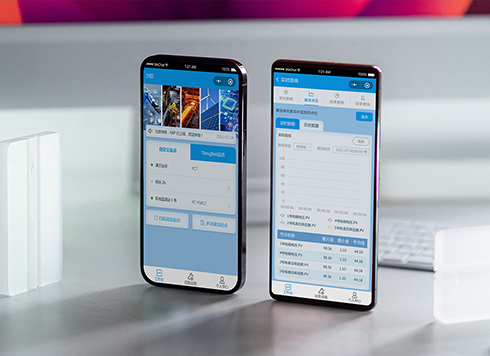 Likong Industrial IoT Tech Co., Ltd. Mini-program UI/UX Design
IIoT firms: mobile mini-program + platform. ...
-
 Livy Pig Farming IoT Platform UI Design
This IoT system uses sensors to monitor hog ...
-
 UI Design of the Internet Advertising Platform (a Sci-tech Sense Official Website)
The corporate website UI features a futuris ...
-
Is grey placeholder text mistaken for filled input because the hint looks too much like content, or because the field label has nowhere to sit?
Date: Nov 4, 2026 Read: 4
-
When users reach the third screen of a form and realize Save is still at the bottom, forcing them to scroll back and forth — should that button stay pinned to the screen?
Date: Nov 3, 2026 Read: 10
-
When support handles dozens of tickets a day, should the two or three most-used row actions move outside the “More” menu?
Date: Nov 2, 2026 Read: 17
-
In the admin, I filter by status, open a ticket, then go back and the list resets to all—did the browser forget, or were the filters never saved?
Date: Nov 1, 2026 Read: 25
-
Bottom-of-page dropdown options show only partially when opened: is the popover not flipping up, or is it clipped by an outer container?
Date: Oct 31, 2026 Read: 29