




Mouse-clicked input fields leave a black ring and designers want it removed site-wide—will keyboard users lose their sense of place?
Mouse-clicked input fields leave a black ring, designers think it looks dirty and ask to remove it site-wide, and keyboard users often lose their sense of place along with it. Under the common 2026 delivery approach, this should not be a binary choice between keeping it and removing it: no ring on mouse click, ring when entering via keyboard Tab, and separate handling by trigger method is the lower-cost way to preserve usability; setting outline to none across the board and leaving only hover highlights is effectively not doing keyboard feedback.
After removing it all, who pays the cost
The motivation for removing outlines is usually valid: browser default focus rings vary across browsers, often conflict with brand guidelines, and a thin light-gray line can look out of place on colorful blocks. The problem is not removal itself, but removal with no replacement—once the style layer zeroes out outline and visual feedback is left only at the mouse-hover layer, keyboard users lose their only positional coordinate. Tab still works at this point, but users cannot predict whether the next Enter will submit, close a dialog, or navigate away from the page.
- Form entry: You cannot see which field has focus, a phone number is typed into the previous field, and validation errors appear only after submission.
- Dialogs and drawers: Focus enters the overlay but is invisible, Esc and Tab cycling both seem broken, and users think the page has frozen.
- In-row table actions: Moving between icon buttons gives no cue, making it easy to click Edit or Delete on an adjacent row by mistake.
These problems are hard to catch in review because mouse demos always look fine: hover and active states are present, and the page appears OK. The issue only surfaces when you put the mouse down and move from the page header to submit using only Tab. This is why many teams in 2026 put it into the front-end acceptance checklist—it cannot be found by scanning design files and looking at screenshots.
What really needs separating is who triggered focus
A ring that appears after a mouse click is noise for most users; a ring that appears when entering via keyboard Tab is a necessary positional cue. These two cases should be judged separately. Newer browsers generally support :focus-visible, which can hide the ring for mouse clicks and show it for keyboard entry; for projects that still need to cover older environments (older engines, some in-app browsers), the common approach is to keep the :focus default ring as a fallback, then layer :focus-visible to control visibility—better to keep an extra ring under the mouse than to have none under the keyboard.
Before adding rings, settle three things: ring width and offset (experience range: about 2px ring width, 1–2px outward offset), two color sets for light and dark backgrounds, and how clearly it is distinguished from error red and destructive-action red. Once these three are set, the remaining issue is coverage.
A review of an admin order-entry system: constraints, approach, and cost
In an iteration in the first half of 2026, I worked on an entry-heavy admin system: the launch window was only three days, a legacy global reset had set outline to none across the board, and the pages mixed a component library with a batch of hand-written selectable cards. The constraint was that the style system could not be changed, only patched locally.
The approach had three stages: first remove the global outline:none so the default ring becomes visible again as a fallback; then define ring styles uniformly with :focus-visible, using two sets—dark ring on light backgrounds and bright ring on dark backgrounds; finally add coverage one by one for custom cards, tab items, and in-row table buttons that the component library did not cover. As a result, when moving from the page header to submit with Tab, only a few dark header blocks and buttons on images were barely visible, and a separate color adjustment was enough.
The cost also needs to be stated clearly: in the first day or two after restoring the default ring, mouse clicks also leave a ring, and design and QA raised the looks-dirty issue several times; it needs to be communicated in advance that this is a transitional state. A separate color set for the dark top navigation added another half day or so. Overall, the experience range for completing this kind of project is mostly 1–2 working days; for projects where all components are hand-written and number in the hundreds, the typical range stretches to 3–5 days.
Three ways to add rings: where cost and coverage differ
There is no universal answer among the three routes; it depends on the number of components, whether there is a design system, and the project's accessibility requirements. The estimates below are for a medium-sized admin project and are an experience range; actual effort varies with component count.
- Keep the browser default focus ring: Cost is close to zero, and cross-background visibility is left to the browser; the downside is that styles vary across browsers and often clash with brand guidelines. Suitable for display-oriented pages with very light interaction.
- Define globally and distinguish trigger method: One definition inherited in many places, covering major elements; main components usually take 1–2 days to complete. The risk is that resets inside components will override it, so spot checks are needed.
- Customize component by component: Strong control—cards, tabs, and table rows can each have their own form; cost rises linearly with component count and omissions are most likely. Suitable for teams with a limited number of components and an existing design system.
When comparing, the question is not which looks better but four points: whether coverage is complete, whether it is visible on both light and dark backgrounds, whether new components inherit it automatically, and who maintains it afterward. In most projects, global consistency plus a small number of component patches is a combination that is relatively easy to implement between coverage and maintenance.
Where it applies and does not apply
The cases suitable for dedicated treatment are fairly clear: admin management, form-heavy entry systems, high-frequency roles that require long periods of keyboard operation, and projects with procurement or acceptance clauses requiring keyboard usability. In these scenarios, missing focus feedback is an operational cost paid every day. Teams delivering admin systems usually put keyboard review together with empty states and error messages, and run through them as part of the front-end acceptance checklist.
The cases that do not need a custom solution are also clear: pages with only one or two submit buttons and no form entry or list operations can simply keep the default focus ring; there is no need to build a branded style set. The same applies to short-cycle campaign pages and pure display landing pages—just do not remove outline. For pages with fewer than ten interactive elements and no high-frequency keyboard operation scenarios, keeping the focus ring visible is enough; no separate design and development resources are needed.
FAQ
If mouse clicks also leave a ring, is the only option to go back to browser default styles?
No. Use :focus-visible to distinguish trigger method—no ring on mouse click and a ring on keyboard entry; for older environments, keep the :focus default ring as a fallback and treat it as a degradation strategy.
Can the focus ring simply use the primary brand color?
It can be used, but it must have enough lightness contrast with the background and be distinguishable from error red and destructive-action red; on dark backgrounds, it is better to use a separate brighter ring color—one color set can hardly be clear on both backgrounds.
If the component library already has focus styles, do I still need to add my own?
First check the official default behavior; if it has been removed by the project's global reset, add it back. You only need to add your own when contrast is insufficient or for things not covered, such as custom cards and table rows.
With hundreds of page elements, do I need to write focus styles one by one?
No. Group by focusable type, use unified selectors plus inheritance to cover major elements, then separately pick out custom components to patch. The focus is finding gaps, not writing each one by hand.
Suggested next step: make keyboard review a fixed ten-minute action before submission—walk the main flow using only Tab, record elements where focus position is unclear as a checklist, then fix in this order: keep the default fallback, define globally, patch custom components. For pages with very light interaction and no high-frequency keyboard scenarios, keeping the default focus ring visible is enough; no extra investment in customization is needed.
-
 UI Design & Prototype for Sunwayland's ThingNet IIoT Platform
UI design and prototyping for ThingNet IIoT ...
-
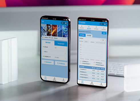 Likong Industrial IoT Tech Co., Ltd. Mini-program UI/UX Design
IIoT firms: mobile mini-program + platform. ...
-
 Livy Pig Farming IoT Platform UI Design
This IoT system uses sensors to monitor hog ...
-
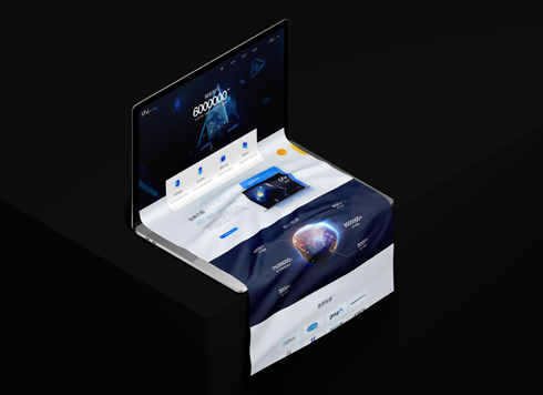 UI Design of the Internet Advertising Platform (a Sci-tech Sense Official Website)
The corporate website UI features a futuris ...
-
Is grey placeholder text mistaken for filled input because the hint looks too much like content, or because the field label has nowhere to sit?
Date: Nov 4, 2026 Read: 4
-
When users reach the third screen of a form and realize Save is still at the bottom, forcing them to scroll back and forth — should that button stay pinned to the screen?
Date: Nov 3, 2026 Read: 10
-
When support handles dozens of tickets a day, should the two or three most-used row actions move outside the “More” menu?
Date: Nov 2, 2026 Read: 17
-
In the admin, I filter by status, open a ticket, then go back and the list resets to all—did the browser forget, or were the filters never saved?
Date: Nov 1, 2026 Read: 25
-
Bottom-of-page dropdown options show only partially when opened: is the popover not flipping up, or is it clipped by an outer container?
Date: Oct 31, 2026 Read: 29