




On meeting-room projection day, the dashboard’s main content sits in the middle with wide empty bands on both sides. The client asks, “Why isn’t the page filling the screen?” Is the issue the design file or the implementation?
The conclusion first: when projected on a 2K screen, if the main content shrinks into the middle with a wide empty band on each side, it is usually not a case of “no adaptation” but of the content area finally having a max width while the whitespace on both sides has not been handled. If the design file is delivered at 1440 and the implementation fills the viewport with percentages, then on a 1920 or even 2560 screen, card width, column gap, and the distance between labels and inputs are scaled up proportionally, and density drops a notch. A common delivery convention in 2026 is: set a max width for the content area first (experience range for admin: 1200–1440px; body text area on corporate sites: 720–880px), then center it; what changes with the viewport is the number of columns and the whitespace tier, not the single-line length. The side whitespace is carried by background continuation and the sidebar reference frame, so it is not mistaken for unfinished work.
First distinguish “not filling the screen” from “no max width on the content area”
When it looks empty on a big screen, do not rush to change the design file. Drag the browser from 1440 to 1920 and look at characters per line in the body area: if a line goes from around thirty-plus characters to fifty or sixty, the container is growing with the viewport, and the problem is that no max width has been set; if characters per line do not change and only a band appears on each side, the max width is already working, and what remains is how to handle the whitespace. These two cases are handled in completely different directions in 2026 projects, and changing them together can easily break a page that was originally fine.
There is also a more subtle case: the container is stretched open, but font size and spacing are not adjusted to the next tier. Body line length grows while paragraph spacing stays the same, making it easy to lose the line when the eye returns, and this is more obvious on content pages than in admin interfaces.
- Card column width grows without limit with the viewport: each card has little content and a lot of whitespace, making it look unfinished.
- Table columns are equally split to fill the width: short fields such as status and time get too much width, while the notes column has to scroll horizontally.
- Modals are sized by percentage: on a large screen a modal can be wider than the body area, and one line of text takes half the screen to read.
- The distance between labels and inputs is stretched: the cost of moving the eye back and forth increases, and form filling slows down noticeably.
Three widths stack in one page, and they need to be discussed separately
If you treat “whether to stretch wider” as a single switch, the conclusion naturally becomes polarized. In fact, viewport width, container width, and line width stack in one page, each handling a different job, and discussing them together leads to one-size-fits-all judgments such as “large screens should fill the width.”
- Viewport width: how wide the browser window is; it determines where breakpoints fall and how many columns to switch to, and should not be used directly as content width.
- Container width: the width actually occupied by the content area; it needs an artificial cap, and the excess should be absorbed by whitespace or sidebars.
- Line width: the readable length of a single line of body text; in Chinese, a common line is 30–45 characters, and in English, 60–80 characters; beyond that, the text should be split into columns or narrowed one more layer.
When setting the container cap, first confirm whether the page has fixed left-side navigation: if it does, the centering reference is the content area, not the whole viewport; otherwise the visual centerline will be off. When setting line width, look at it together with paragraph spacing; if line length is narrowed while paragraph spacing stays unchanged, it actually feels cramped.
Stretch, fixed-width centered, and grid with a max width: matching the three approaches
There is no hierarchy among the three approaches, only fit or misfit. Before choosing, answer one question: is the main task of this page “scanning and comparing” or “reading item by item”? The former is afraid of density dropping, and the latter is afraid of line length running out of control; different answers lead to different approaches.
- Option A · Fully fluid stretch: percent-based fill with no max width. Low implementation cost, and it adds almost no extra schedule; the price is that density drops on large screens and line length easily runs out of control. It is used more often for pure data dashboards and a single large table.
- Option B · Fixed-width centered: the content area has a fixed max width and is then centered. The layout is stable, the design file and implementation are basically consistent, and there are fewer revisions; the price is that whitespace on both sides of ultra-wide screens is obvious, background continuation needs extra handling, and review takes about half a day more (experience range).
- Option C · Grid + breakpoints + max width: the content area has a max width, columns switch by breakpoint (commonly 4/8/12 columns), and whitespace jumps by tier rather than scaling continuously. It balances density and stability; the price is maintaining a breakpoint table and doing one more review round before delivery, commonly half a day to a day extra (experience range).
If the project can afford only one set of design files, a simplified version of Option C is more practical: first fix the content max width and breakpoint table, and switch columns only at two or three tiers. Common breakpoints are 1280 / 1440 / 1600 / 1920, and not every tier needs separate adaptation.
On delivery: only one 1440 design file, and it still has to be projected in the meeting room
A common situation is: the client provides only one 1440 design file, the admin system still has to be demonstrated on a 2K screen in the meeting room, and neither the schedule nor the budget is enough to add a 1920 version. Our approach is to first set the content max width at around 1360, centered, prioritize table columns as “identifier column, status column, numeric column, action column,” let only the notes column absorb excess width when it is too wide, bring modals and drawers under the same max-width set, and continue the background in the same color on both sides. The result is that the projection no longer looks scattered; the price is a band left on each side. Before the demo, confirm with the client how the background should extend; otherwise it is easy to be sent back once for “the page not filling the screen,” and this kind of rework typically takes half a day to a day.
A simpler approach is to write the convention into a one-page delivery note: extract the max width into a shared style variable, and explain the breakpoint table, table column width strategy, and modal max width in one go, so design, frontend, and acceptance stakeholders read the same document. Large-screen adaptation problems are almost impossible to find during developer self-testing; they only surface when projected in the meeting room.
When this applies and when it does not
This approach suits projects where only one width of design file has been produced but multiple terminals need to be covered, especially corporate sites, content sites, admin systems, and form-heavy process pages—their content has clear reading units and comparison units, and once width runs out of control, both density and readability collapse.
The boundaries also need to be clear: pure data dashboards, maps, Gantt charts, editing timelines, and similar views should themselves fill the screen, and forcing a max width wastes space; for mobile-first pages, a width cap has little meaning, and hot zones and breakpoints matter more; for an intranet system with only one fixed terminal and controllable resolution, set the width directly by actual resolution, and there is no need to introduce another set of breakpoint rules.
FAQ
With only one 1440 design file, should we add a 1920 version?
There is no need for a full set of design files. Adding a screenshot of key pages at 1920 and confirming how the content max width and side whitespace are handled is enough; it commonly costs less than half a day and saves the implementation team from guessing.
Can admin and corporate-site content max widths be the same number?
No. Admin systems are more tool-like, and 1200–1440px is a typical range; corporate-site body text needs to be narrowed one more layer so a line falls at 30–45 Chinese characters, which is more comfortable to read.
The side whitespace looks empty; can we fill it with a background color?
You can use the same color or a very light transition to carry the whitespace; do not let the background break in the middle. When the page has a fixed sidebar, use the content area rather than the whole viewport as the centering reference, or the centerline will be off.
On a large screen, is evenly distributing table column widths neater?
Not recommended. Sizing short fields to their content and designating one column to absorb excess width looks better and produces less horizontal scrolling; equal distribution only looks acceptable in tables where field lengths are close.
Should modals and drawers also be included in the max-width rules?
Yes, manage them together. A modal sized by percentage can be wider than the body area on a large screen, so it is usually brought under the same set of rules; the typical max width range for modals is 480–720px.
When implementing, start with one thing: write the current page’s content max width, breakpoint table, and table column width strategy into a one-page delivery note, so design, frontend, and acceptance stakeholders read the same convention. Pages whose content has clear reading units benefit clearly; if the project is already a pure dashboard or has only one fixed terminal, set the width by actual resolution, and there is no need to adapt for adaptation’s sake.
-
 UI Design & Prototype for Sunwayland's ThingNet IIoT Platform
UI design and prototyping for ThingNet IIoT ...
-
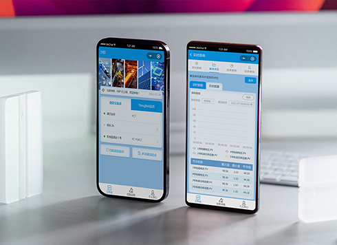 Likong Industrial IoT Tech Co., Ltd. Mini-program UI/UX Design
IIoT firms: mobile mini-program + platform. ...
-
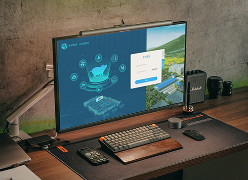 Livy Pig Farming IoT Platform UI Design
This IoT system uses sensors to monitor hog ...
-
 UI Design of the Internet Advertising Platform (a Sci-tech Sense Official Website)
The corporate website UI features a futuris ...
-
Is grey placeholder text mistaken for filled input because the hint looks too much like content, or because the field label has nowhere to sit?
Date: Nov 4, 2026 Read: 4
-
When users reach the third screen of a form and realize Save is still at the bottom, forcing them to scroll back and forth — should that button stay pinned to the screen?
Date: Nov 3, 2026 Read: 10
-
When support handles dozens of tickets a day, should the two or three most-used row actions move outside the “More” menu?
Date: Nov 2, 2026 Read: 17
-
In the admin, I filter by status, open a ticket, then go back and the list resets to all—did the browser forget, or were the filters never saved?
Date: Nov 1, 2026 Read: 25
-
Bottom-of-page dropdown options show only partially when opened: is the popover not flipping up, or is it clipped by an outer container?
Date: Oct 31, 2026 Read: 29